Plain wallpapers and subtle wallpapers are less eye-catching than wallpapers with large or expressive patterns. Used skilfully, however, they are essential for a coherent interior design.
What is a plain wallpaper?
In addition to classic plain wallpapers, which are printed in a single colour over the entire surface, we also consider wallpapers with discreet, small patterns or wallpapers whose patterns are monochrome or tone-in-tone to be plain wallpapers.
A perfect match for statement wallpapers
Whether without any pattern at all or with small or only hinted patterns: what all plain wallpapers have in common is that they serve less as eye-catchers in the room, but rather complete its interior design. In this respect, they compete with monochrome painted walls. However, they can lend the room additional depth and special style thanks to their discreet patterns or a special surface structure.
If accents are created in the room by means of a statement wallpaper, for example in the form of a colour-intensive floral wallpaper, plain wallpapers with a more restrained colour scheme can be applied to the remaining walls.
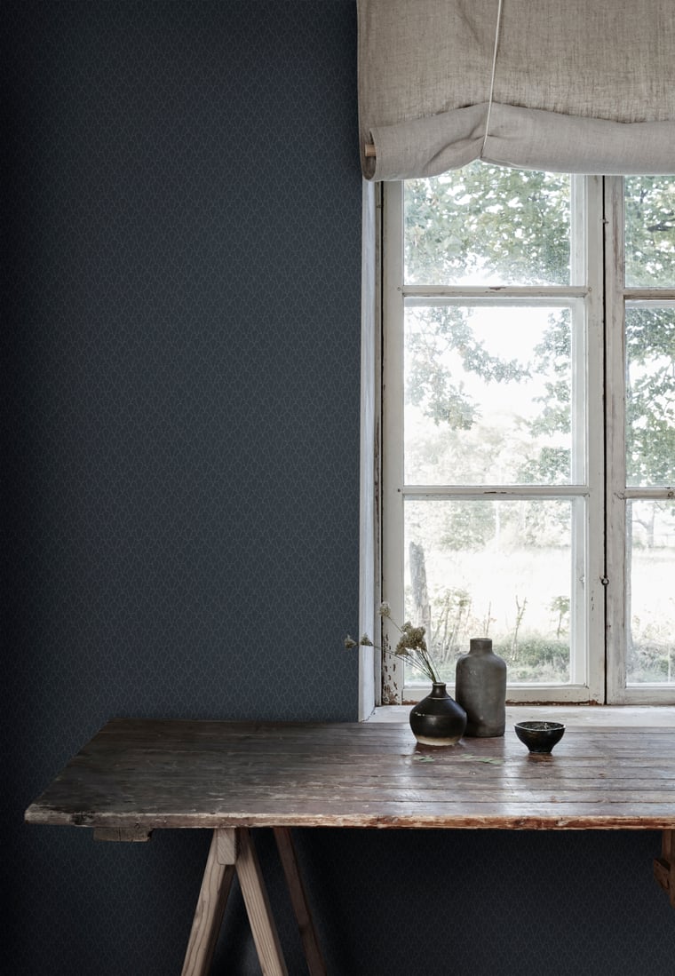
Bok by Sandberg
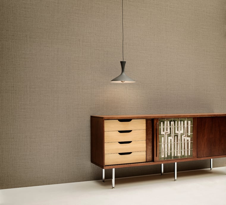
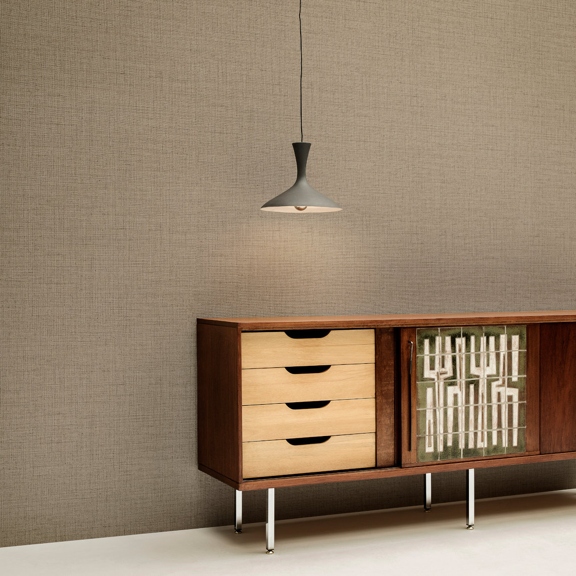
Puro by Arte
Plain wallpapers as the main design element
Plain wallpapers often play a central role, especially for understated, minimalist Scandinavian interior design. Here, all walls are covered with wallpaper in muted colours or with discreet patterns. In this way, the equally restrained furniture and fabric designs are brought out to their full potential.
Blostma by Farrow & Ball
Finding the right colour tone
Many of the brands in our shop offer plain wallpapers specifically designed to complement their eye-catching statement wallpapers, such as Swedish manufacturer Borås Tapeter or Belgian premium wallpaper brand Arte.
As an alternative to applying a monochrome plain wallpaper, the wall can of course also be painted in the corresponding shade. If you are looking for a colour to match a wallpaper, the recommendations in our shop will help you: The MEINWAND design team has selected matching shades by the British paint manufacturers Farrow & Ball and Little Greene for many of our pattern wallpapers.
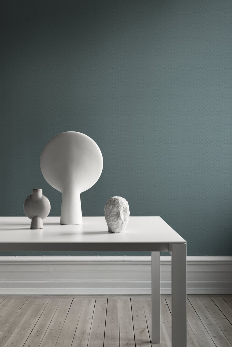
Sashiko by Sandberg
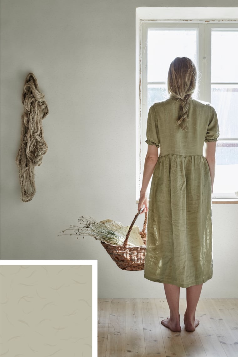
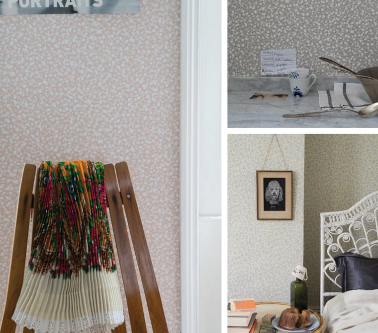
Washi by Sandberg
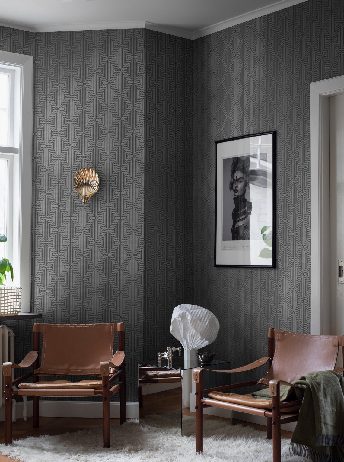
Garbo by Borås Tapeter
Plain wallpapers with patterns or special surface structures
One important reason why plain wallpapers are so popular with interior designers are their varied, often barely perceptible patterns or structures, which nevertheless have a decisive influence on the room - such as the discreet geometric pattern of the Garbo wallpaper or the restrained, stylish fabric structure of the Puro wallpaper. Irregular organic patterns, as in the Washi or Blostma wallpapers, also create a calm yet pleasantly lively effect on the wall. For the production of the Blostma wallpaper, Farrow & Ball also applies the same colour pigments that are used for the paints of the traditional British manufacturer. Thanks to an elaborate classic printing technique, the pattern is characterised by a pleasant, tactile feel and changes the reflective properties of the wallpaper depending on the incidence of light.
Subscribe to the MEINEWAND blog
Never miss another blog post again!
We'll keep you informed by e-mail of each new blog post.

- Discover plain wallpapers at MEINEWAND
- Paint products by Farrow & Ball at MEINEWAND
- Scandinavian sytle wallpapers at MEINEWAND
Picture Source: Arte (Header), Sandberg, Arte, Farrow & Ball, Sandberg (2), Borås Tapeter