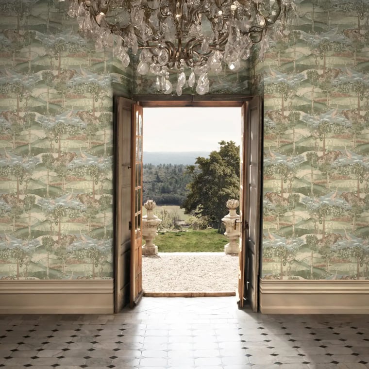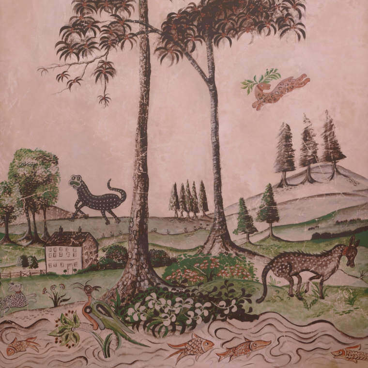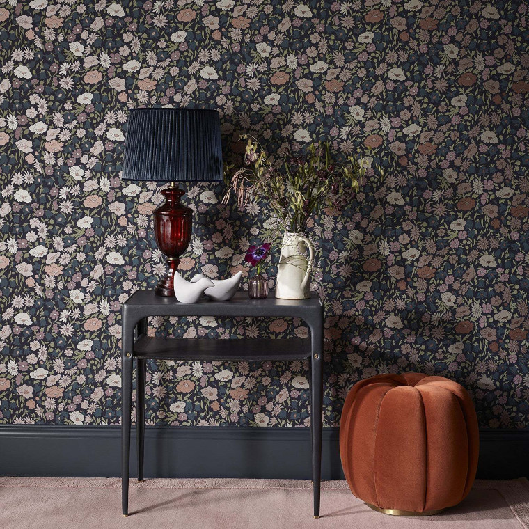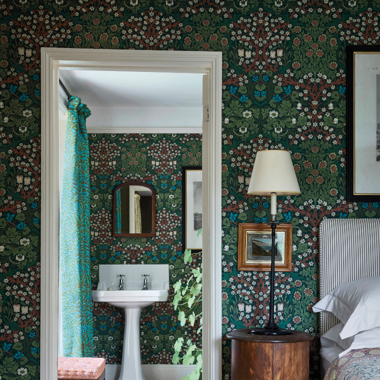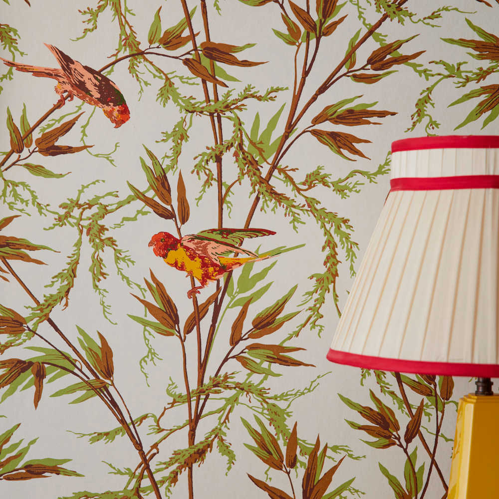
Wall icons: The Contemporary Selection
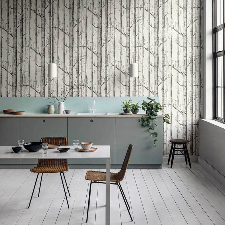
With its carefully curated collection, The Contemporary Selection, English luxury wallpaper brand Cole & Son brings together its most famous patterns from the Swinging Sixties and mid-century modern design, including the manufacturer's most famous wallpaper, Woods. The selection has lost none of its power to this day.