Living like in a hotel
Interior design styles have been finding their way into private rooms for some years now. The skilful use of wallpaper and colours plays an important role in this.
Posts about:

Interior design styles have been finding their way into private rooms for some years now. The skilful use of wallpaper and colours plays an important role in this.
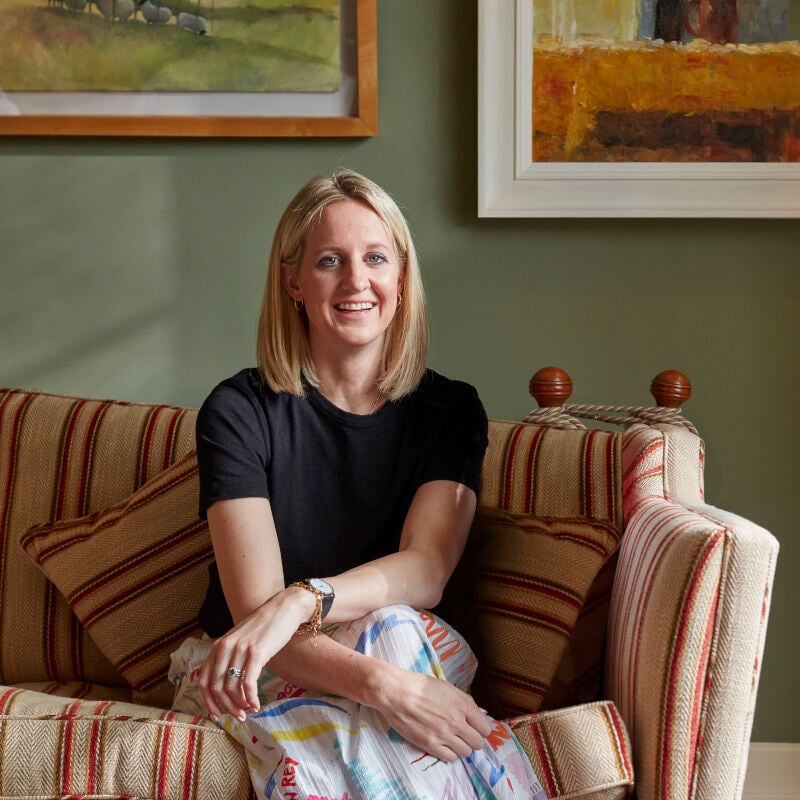
Ruth Mottershead is Little Greene's creative director. In her role, she is responsible for developing new colour tones and designing the wallpaper collections. She comes from the family of owners of the long-established English family business in Manchester and has been involved with colour since she was a child. Master interior decorator Kai Bergen from MEINEWAND spoke with her.
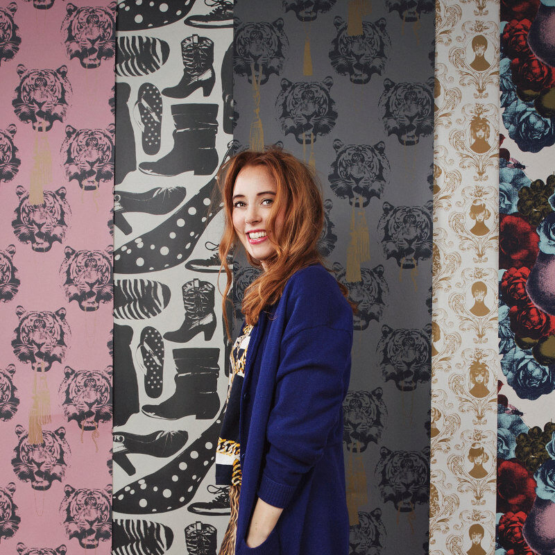
Swedish wallpaper designer Lisa Bengtsson is known for her expressive patterns. We asked her to select matching colours from the MEINEWAND range that can be combined with her most famous wallpapers.
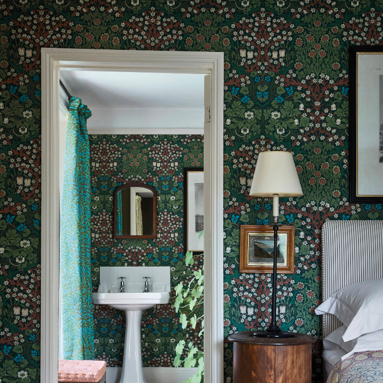
The wallpapers by William Morris continue to inspire to this day. The co-founder of the English Arts and Crafts movement succeeded in the 19th century in what designers rarely achieve: his classics not only suit the classic British interior style, but can also be used for modern wall designs.

London based Wallpaper designer and painter Sian Zeng was born in China and grew up in Hungary. After graduating from the renowned Central Saints Martins College she founded her own label. We spoke to her about her approach to colour and asked her for tips on paint colours that can be combined with her wallpapers.
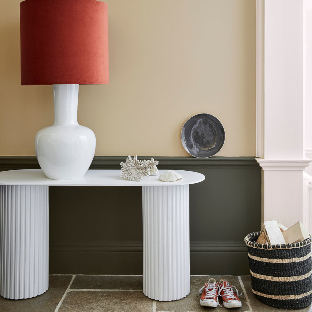
Colours with warm undertones ensure timeless harmony in both classic and modern interior styles. The English paint manufacturer Little Greene has also taken up this theme and derived inspiring neutral shades from it. With the Stone colour palette, it offers modern New Neutrals colour shades that are perfectly matched to different room situations.
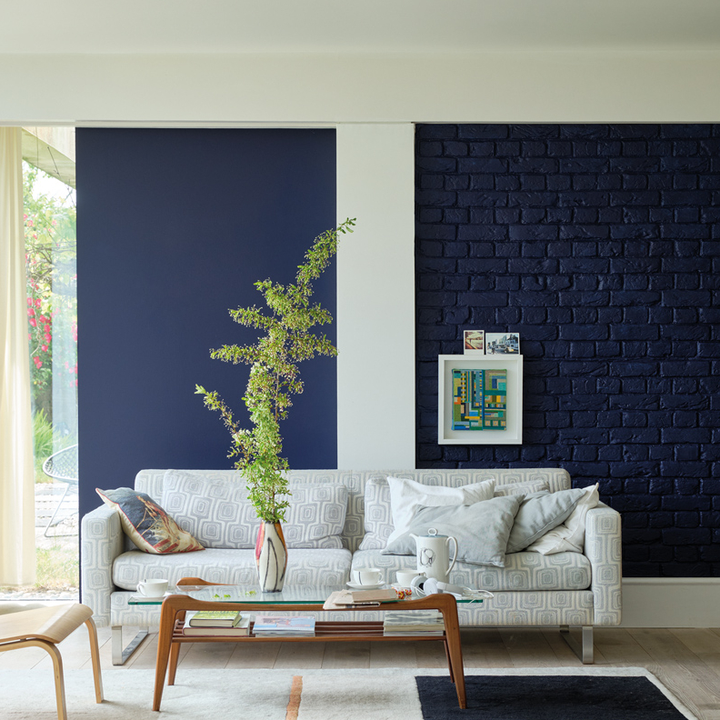
The skilful combination of colours and textures is a central element of perfect interior design. This also includes the combination of glossy and matt surfaces in the same colour. The juxtaposition of matt and gloss creates dynamism and gives the room depth, character and a touch of avant-garde elegance.
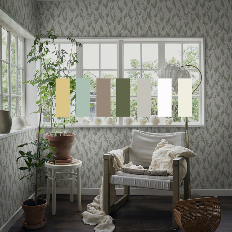
Matching walls and interior tone on tone has a long tradition in Scandinavian interior design. The effect is restrained and timeless.
A good starting point for this very Nordic colour concept are the wallpapers of the traditional Swedish brands Sandberg and Boråstapeter, many of which are in subtle colours. Clear white or grey components in all colour tones allow the wallpapers to recede visually in the room.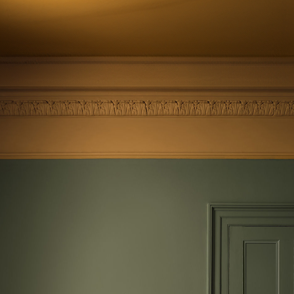
Choosing the right colour for the ceiling is important for a harmonious room concept. However, when designing a room with colour, the focus is usually on the colour of the walls. The ceiling is often overlooked. In this article, I show you what you should consider when choosing the ceiling colour.
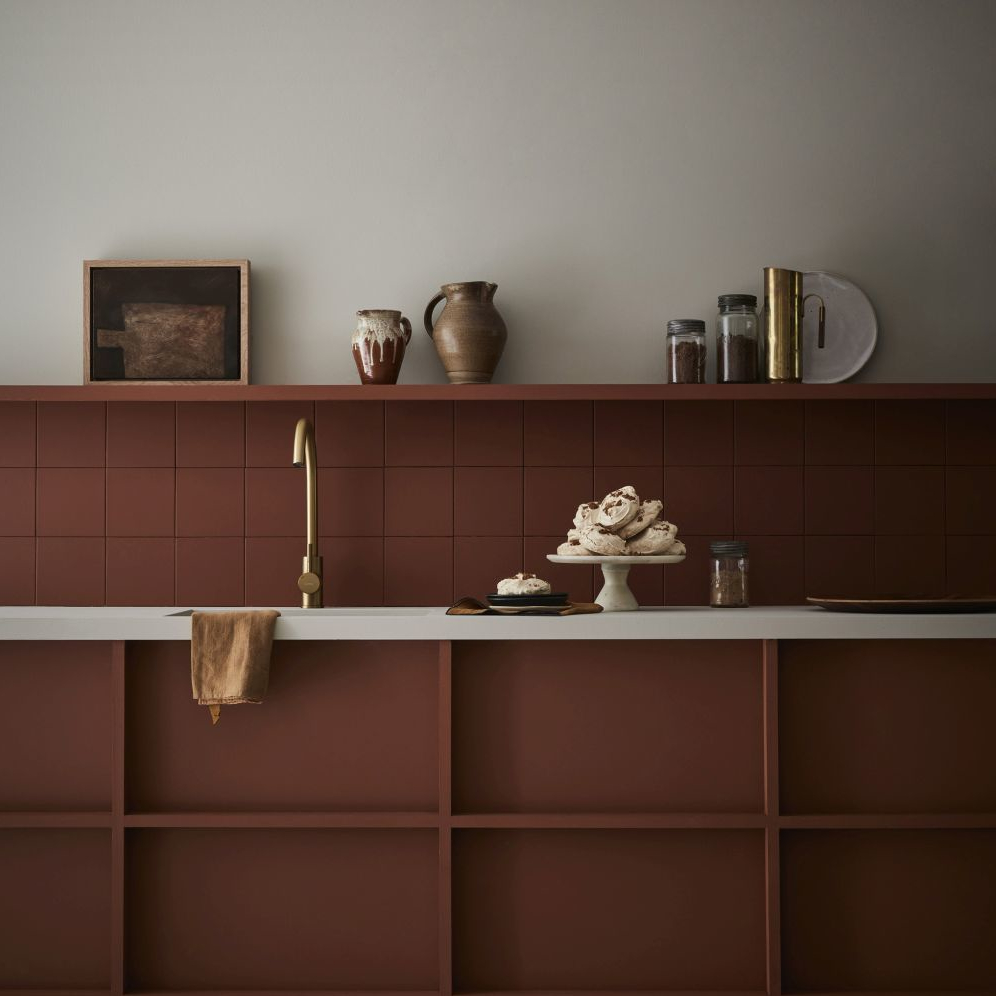
The new Sweet Treats special colour collection from Little Greene focuses on warm honey, caramel and chocolate tones. A total of 9 colours can be used to create cosy interiors. They are named after well-known desserts and sweet baked goods.