Matching wallpaper and interior tone on tone creates a calm, relaxed atmosphere in the children's room that leaves plenty of room for imagination.
The choice of wallpaper
A good starting point for such an interior design concept are the wallpapers of the traditional Swedish brands Sandberg and Boråstapeter, many of which are kept in subtle colours. The Spanish manufacturer Coordonné also often relies on clear white or grey components in its children's wallpapers, which allows the wallpaper patterns to recede visually in the room.
Pick up the colours of the wallpaper
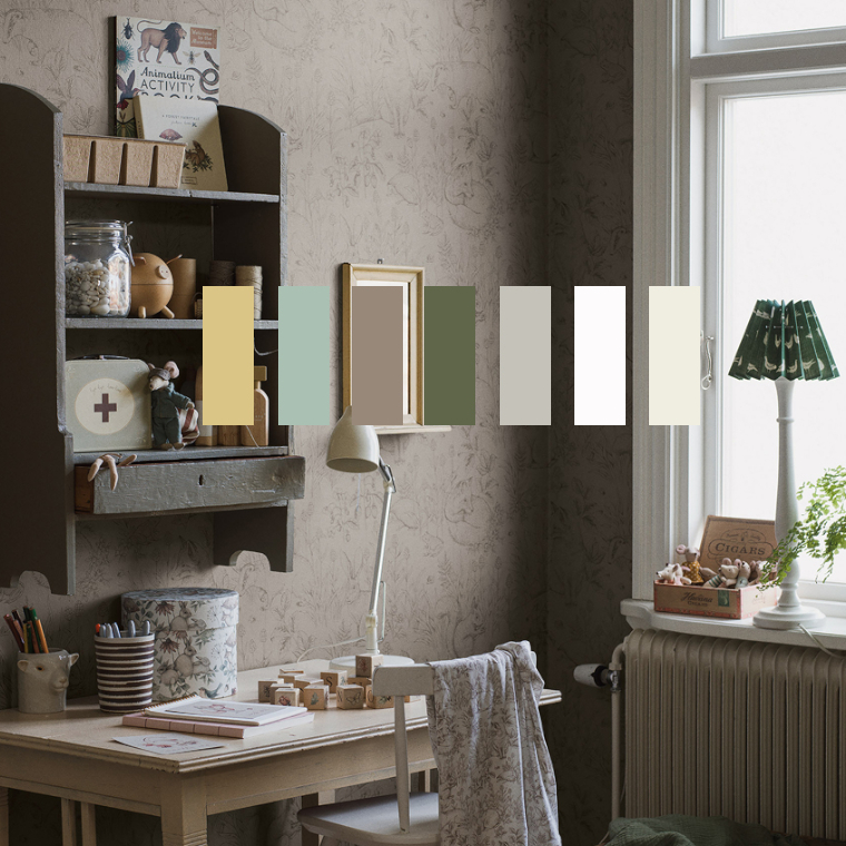
In the next step, the other walls of the room as well as cupboards, doors, windows or wooden walls are painted exclusively with shades that appear in the wallpaper. The example of the Forest Friends wallpaper by Boråstapeter (colour variant 7487), for which I have put together matching colours by Little Greene, shows this well.
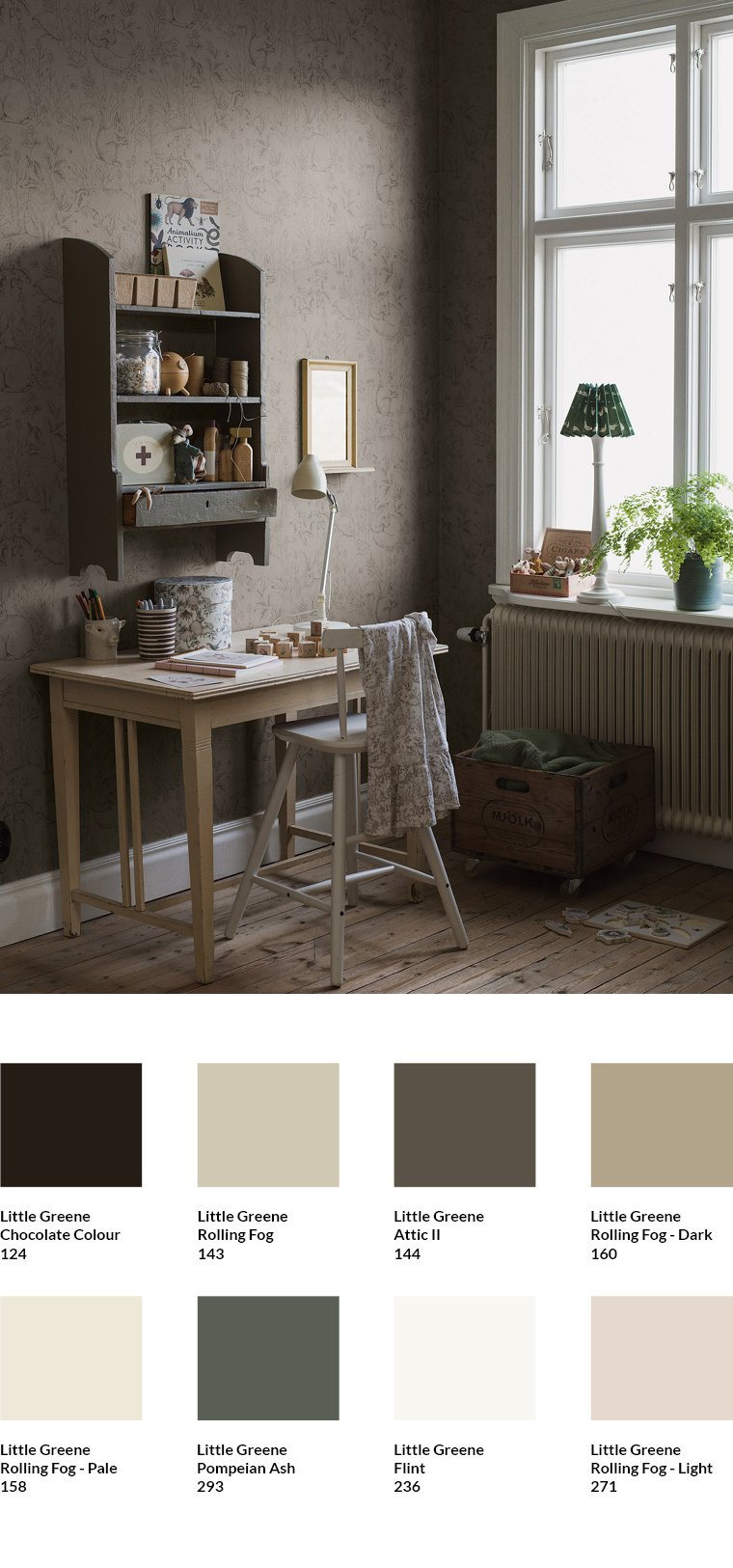
The Little Greene shades that I chose to combine with the wallpaper pick up on the basic character of the shades contained in the wallpaper. These include off-white shades such as Flint or Rolling Fog - Pale. The shade Pompeian Ash, which was used for the hanging shelf, also comes from the wallpaper. It harmonises perfectly with the wallpaper, but sets an accent in the room due to its strong character.
Use mixed tones for accents
Also with the Jasmine wallpaper by Boråstapeter (colour variant 7468), a somewhat stronger shade was used for the door of the wall cupboard. In this case, it is Chromarty by Farrow & Ball. It is perfect for a tone-on-tone nursery because it is a blend of several shades found in the wallpaper. The other, lighter shades such as Wimborne White and Farrow`s Cream appear in exactly the same way in the wallpaper.
Pick up the colour components of the wallpaper
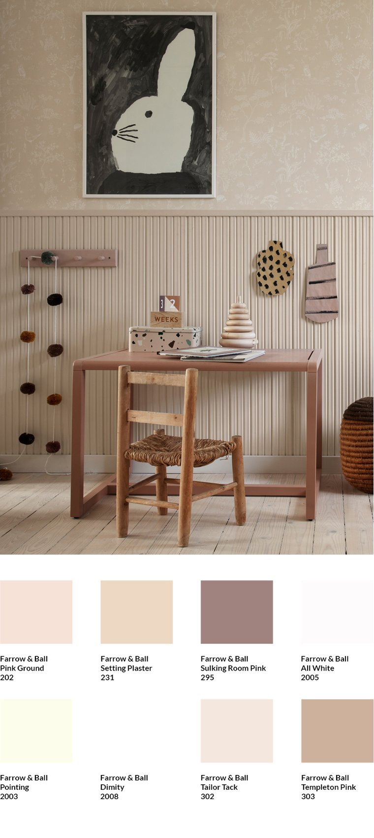
For the wallpaper Hollie by Sandberg (colour variation Peach) I picked out colour shades by Farrow & Ball. The wood panelling was painted with Tailor Tack, which matches the background of the wallpaper. The background colour of the wallpaper has a slight pink touch. Therefore, Sulkingroom Pink, which is used for the table, and Pink Ground, which was used for the coat rack, go very well with the wallpaper. The brown part of the wallpaper also goes very well with the waxed floor and the wooden chair.
Balanced tone on tone
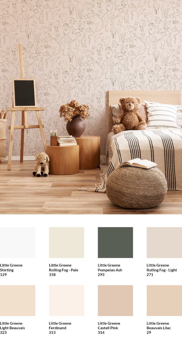
A very balanced tone-in-tone concept was implemented in the Zoology wallpaper by Coordonné in the Natural colour variant. The wood tones harmonise perfectly with the colours of the wallpaper. If other elements in the room are to be painted, brown and pink shades from Little Greene such as Light Beauvais and Ferdinand are suitable. Pompeian Ash can be used as a darker shade. As I have taken it from the colours of the animal motif, it can be used for harmonious accents.
Find matching colours in the MEINEWAND shop
In the MEINEWAND shop I have already compiled matching shades for many wallpapers. You will find them below the wallpapers.
Subscribe to the MEINEWAND blog
Never miss another blog post again!
We'll keep you informed by e-mail of each new blog post.

- Discover colours from Farrow & Ball at MEINEWAND
- Discover Little Greene colours at MEINEWAND
- Blog post: New neutrals - warm colours for smart rooms
Image source: Boråstapeter (1, 2 ), Sandberg, Coordonné; Aufmacher Boråstapeter