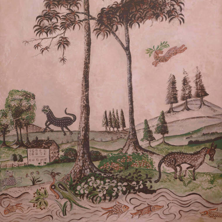
Combining wallpaper and paintings
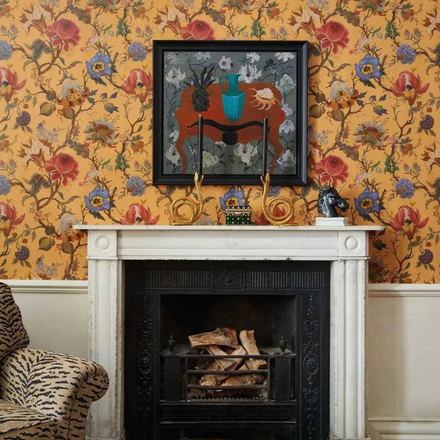
Wallpaper and paintings can be combined effectively. MEINEWAND colour expert Kai Bergen has compiled a list of things to consider when doing so. Sebastian Stahl spoke to gallery owner Oliver Ahlers, who presents works of classical modernism in front of bird wallpaper by Osborne & Little.