Scandinavian tone on tone
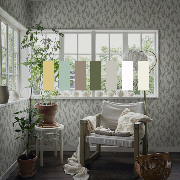
Matching walls and interior tone on tone has a long tradition in Scandinavian interior design. The effect is restrained and timeless.
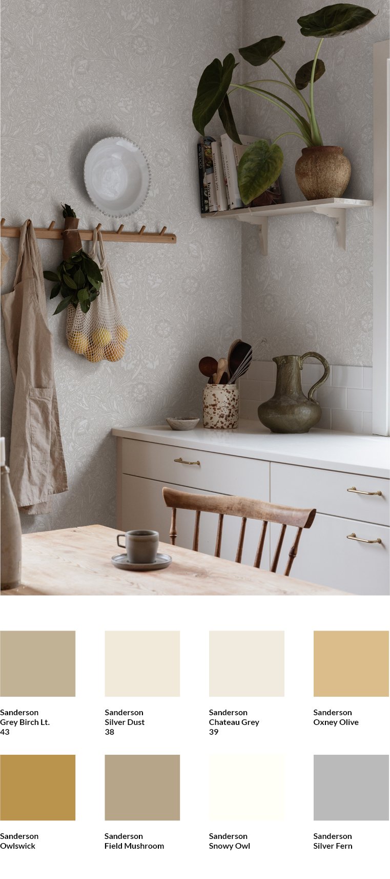
A good starting point for this very Nordic colour concept are the wallpapers of the traditional Swedish brands Sandberg and Boråstapeter, many of which are in subtle colours. Clear white or grey components in all colour tones allow the wallpapers to recede visually in the room.When the other walls of the room as well as cupboards, doors, windows or wooden walls are painted in shades that match those of the wallpaper, the subtle effect that characterises Scandinavian tone-on-tone is created. The example of the Caroline wallpaper by Sandberg, for which I have put together matching colours by Sanderson, shows this well.
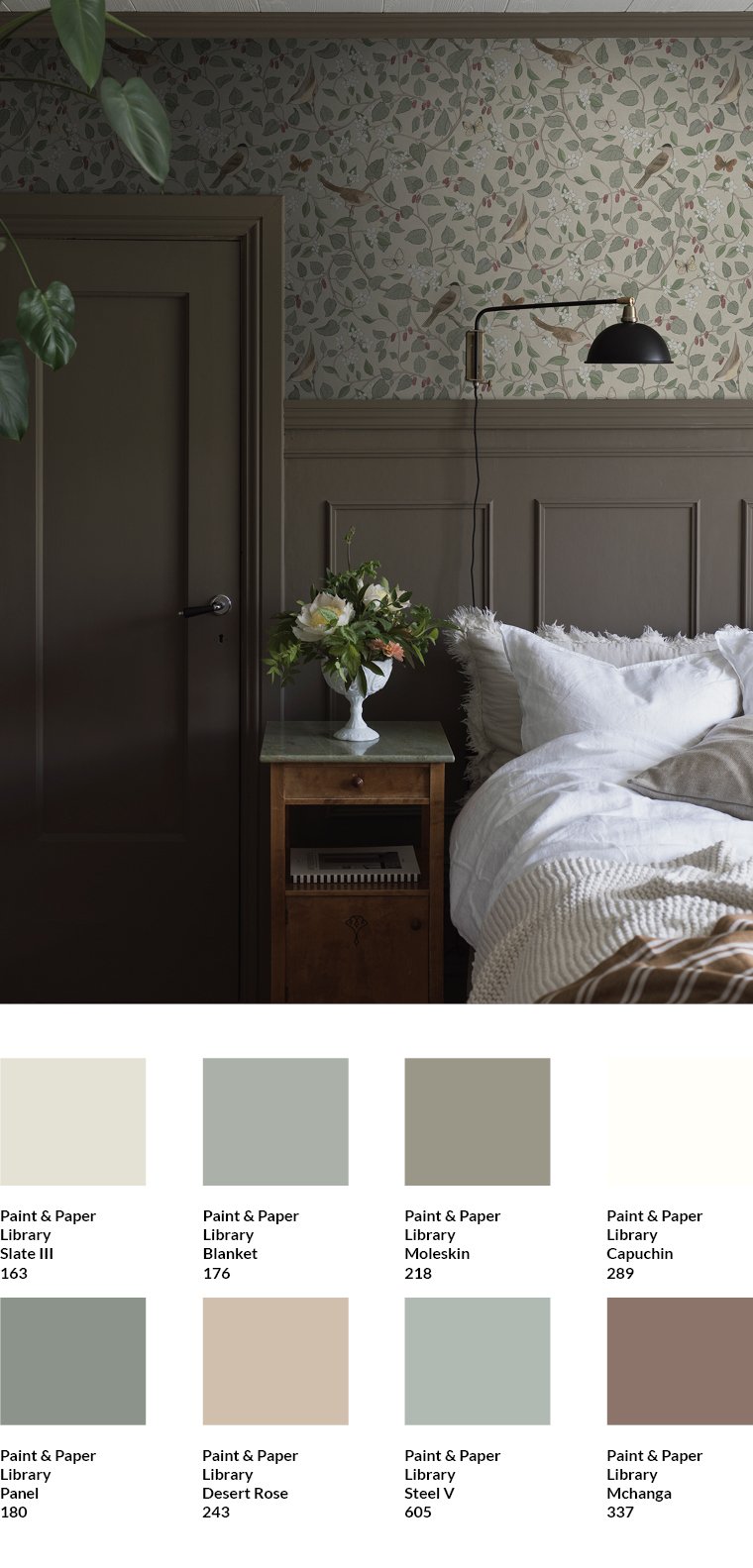
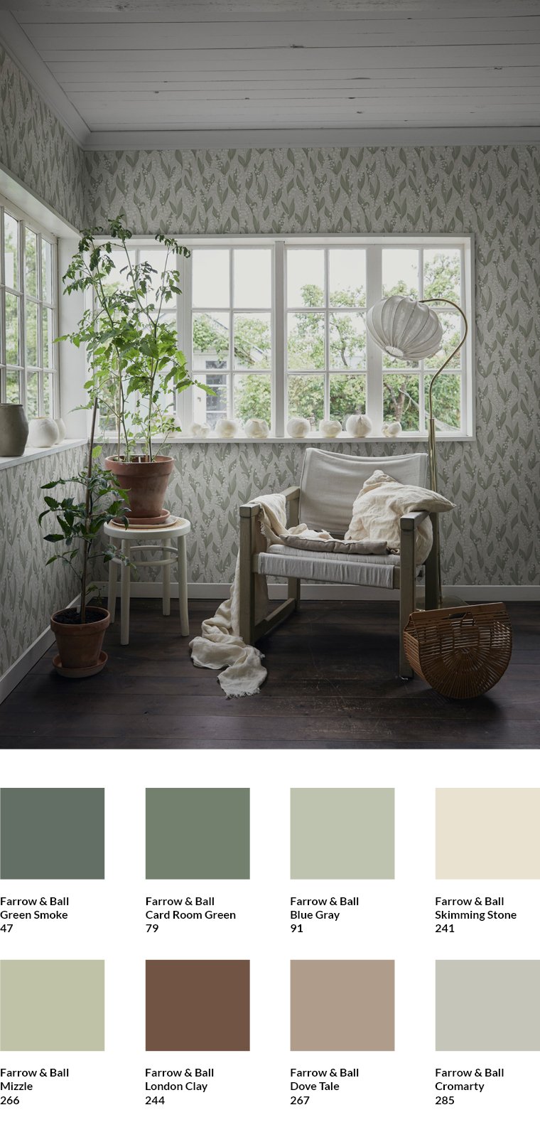
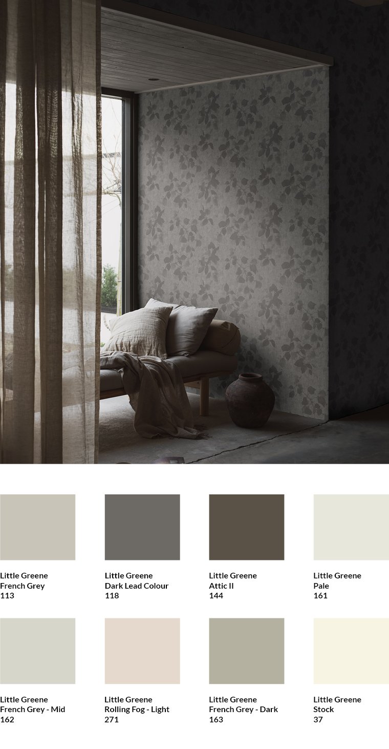
All the colours from Paint & Paper Library, Little Greene, Sanderson and Farrow & Ball that I chose for the four rooms to combine with the wallpapers pick up on the basic character of the shades contained in the wallpapers. This is why they include off-white tones such as Stock by Paint & Paper Library, powdery greens such as Oxney Olive by Sanderson or browns with a high grey content, such as London Clay by Farrow & Ball. They all go perfectly with one of the four wallpapers.
The example of the Sangfaglar wallpaper by Boråstapeter, for which I have selected colours from the Paint & Paper brand, shows that with Scandinavian tone-in-tone, it is not always necessary to pick up the main colour tone of the wallpaper. In this case, it would be a lighter shade of green. The colour of the door, the coffered wall and the ceiling moulding, however, is a mixed tone that is created by combining different colour tones of the wallpaper.
In addition to wallpapers and the colours of walls, cupboards, doors, windows or wooden walls that match them, the rest of the interior must also be selected specifically: Furniture and floors made of waxed or oiled wood look harmonious with all four wallpapers. Broken white tones in fabrics and ceramics complete the picture. This is clearly visible in the wallpaper Liljekonval by Sandberg, which I combined with colours by Farrow & Ball, or the wallpaper Alma by Boråstapeter, for which I chose matching colours by Little Greene.
Find matching colours in the MEINEWAND shop
In the MEINEWAND shop I have already compiled matching shades for many wallpapers. You will find them below the wallpapers.
Subscribe to the MEINEWAND blog
Never miss another blog post again!
We'll keep you informed by e-mail of each new blog post.
- Discover colours from Farrow & Ball at MEINEWAND
- Discover Little Greene colours at MEINEWAND
- Blog post: New neutrals - warm colours for smart rooms
Image sources: Sandberg (1, 3 ), Boråstapeter (2, 4 ), Sandberg lead story

