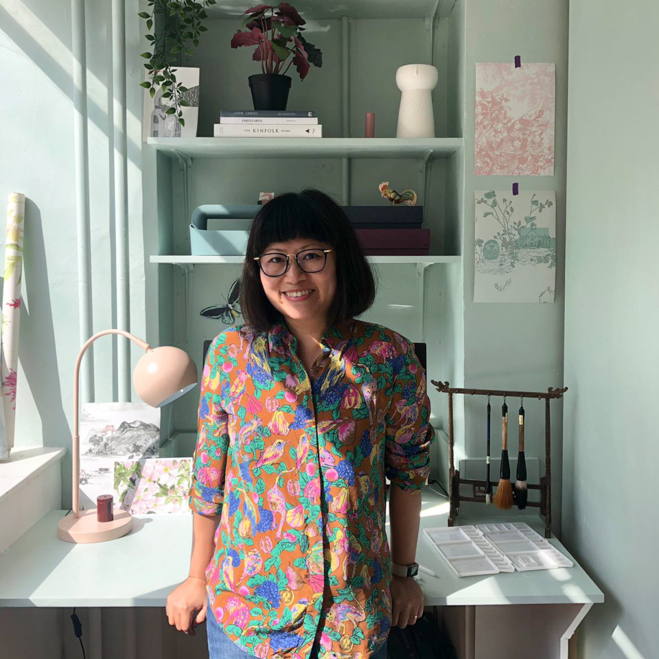
London based Wallpaper designer and painter Sian Zeng was born in China and grew up in Hungary. After graduating from the renowned Central Saints Martins College she founded her own label. We spoke to her about her approach to colour and asked her for tips on paint colours that can be combined with her wallpapers.
Sebastian Stahl: Sian, many of the wallpapers of your label are striking and understated at the same time. This fascinating effect is strongly connected to your choice of colour. How would you describe your approach to colour?
Sian Zeng: My approach to selecting colours mirrors my artistic painting style. I blend multiple colours, effectively dirtying them to reduce their saturation in order to create a more natural and nuanced palette. For instance, I often mix a touch of yellow, brown, or blue into viridian green to craft varied and more sophisticated shades of green. This technique ensures that the colours in our designs are more natural and sophisticated.
Sebastian: So, your wallpapers combine your background as a designer with your background as a painter?
Sian: Each design is indeed crafted with the intention of transcending mere decoration; I want our customers to feel as though they have acquired a large-scale, intricate piece of art. The detailed patterns and refined colour choices are central to this experience.
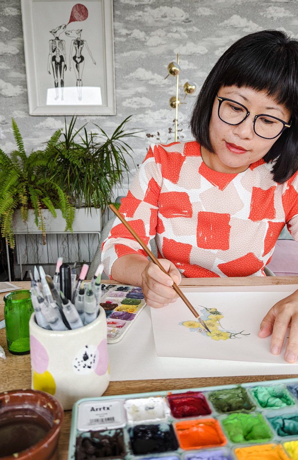
Sian Zeng designs all patterns by hand in her studio.
Sebastian: How do you decide which colour to use for each design?
Sian: In the design conceptualization process, I imagine a diverse range of environments where the pattern would effortlessly blend in. This visualization guides me towards a colour scheme that encapsulates those distinct ambiences. This considerate and detailed approach is key to creating wallpapers that not only enhance the aesthetics of a space but also align with the moods and styles inherent in contemporary living spaces.

Sebastian: Do you associate the colours of your wallpapers with a specific application or its use in a specific room?
Sian: Yes, I do associate the colours of our wallpapers with specific applications or their use in particular rooms, as each colour palette is thoughtfully selected to elicit a certain mood or atmosphere within a space.
Take, for instance, our Clouds Black wallpaper. This design was specifically envisioned for our spare bedroom, which doubles as a multifunctional area equipped with an overhead projector. The deep, dark tones of the wallpaper are ideal for absorbing light, making it an excellent choice for transforming the room into a cozy cinema space. We're excited about the prospect of installing this wallpaper in the cinema room shortly.
Our vibrant designs such as Jungle or Dino often work beautifully in children's bedrooms, creating a playful and imaginative environment perfect for little ones to learn and be inspired in.
On the other hand, our wallpapers with more subdued colour patterns, such as Hua Trees or Clematis, are wonderfully suited for adult spaces like bedrooms and living rooms. They offer a sophisticated touch of design that's impactful yet not overpowering.
Sebastian: How do you decide which colourways you want to provide for each design?
Sian: It is crucial to remember that colour interpretation is highly subjective. Therefore, we strive to provide a diverse selection of colourways, ensuring there's something appealing for everyone's taste.
A lot of our customers send us photos after they have finished the redecoration. We are continually amazed at the unique ways our customers integrate and style our wallpaper, showcasing the versatility and broad appeal of our designs.
>> Find out more about Sian Zeng's approach to design in this blog article

Sian’s choices for matching paint colours by Farrow & Ball and Little Greene
Sian Zeng has selected matching paint colours by Farrow & Ball and Little Greene for walls or furniture for her wallpapers. We asked her to explain her choice for six of her designs.
1. Clouds / Black
This colourway of our Clouds wallpaper, in essence, is not just black as pure black paint doesn’t exist. While it may seem black at first glance, it possesses the warmth of a very dark brown, creating a sophisticated depth. To harmonize with this unique shade, we've curated a selection of Farrow & Ball colours that complement our wallpaper perfectly. For a serene and refined ambiance, pair it with the soft hues of Dimpse and Cornforth White. To achieve a more striking and dramatic effect, incorporate the darker tones of Mole's Breath and Tanner's Brown.
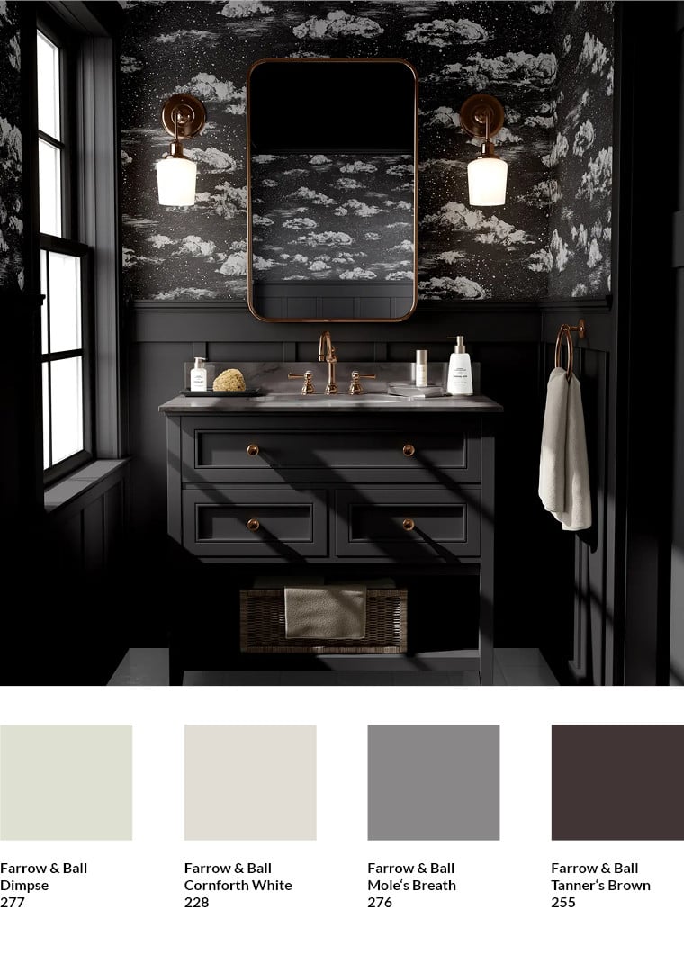
Clouds wallpaper by Sian Zeng
2. Desert / Green Sand
The Green Sand colourway of our Desert wallpaper holds a special place in my heart. Its charm lies in the subdued colours paired with a design that boldly reimagines traditional roles of subject and background. Typically, the vibrant flora and fauna take centre stage, but in this design, they fade into soft whispers, allowing the background to capture the spotlight with its richer hues.
To enhance this unique atmosphere, we paired it with Farrow and Ball’s Vert de Terre and Pavilion Blue, chosen to compliment the wallpaper's background. These colours merge seamlessly, creating an expansive landscape of greens and blues that give the room an open, airy feel.
For those looking to add definition to their space, I recommend Farrow and Ball's Dix Blue. It frames the wallpaper as if it were a piece of art, delineating clear zones and adding structure to the room. Additionally, Calluna brings a touch of elegance with its sophisticated lilac hue. It complements the desaturated purples found in some cacti designs, infusing the room with a sense of luxury.
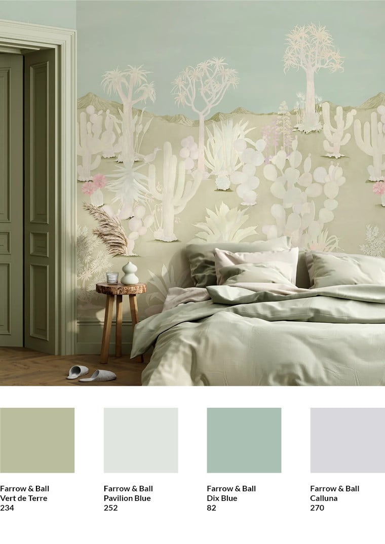
Desert wallpaper in colourway Green Sand by Sian Zeng
3. Desert / Sand
The Desert Sand colourway most faithfully captures the original hues of the painted design, featuring a warm, pastel palette. The tones of Farrow & Ball's Lichen and Dix Blue evoke the charm of vintage botanical illustrations, creating a cozy, countryside ambiance when paired with our wallpaper. For those aiming to amplify the design's earthy warmth into a bold statement, Setting Plaster is an excellent choice. Meanwhile, I’ve selected Farrow & Ball's Dimpse for its understated sophistication, allowing our wallpaper to take centre stage and define the room’s character.
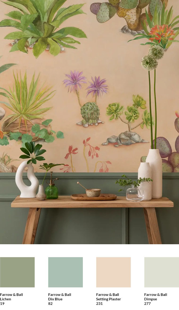
Desert wallpaper in colourway Sand by Sian Zeng
4. Woodlands / Brown Pink
Our Woodlands Wallpaper in brown pink was among the first designs we launched and has since become a favorite for many girls' bedrooms. To craft a lighter, more airy atmosphere, I recommend Little Greene’s Rolling Fog. For a moodier ambiance, Blush is an excellent choice. For accents like furniture, skirting boards, or even floorboards, Knightsbridge and Roman Plaster are ideal, though I would advise against using them on adjacent walls to maintain the wallpaper’s prominence.
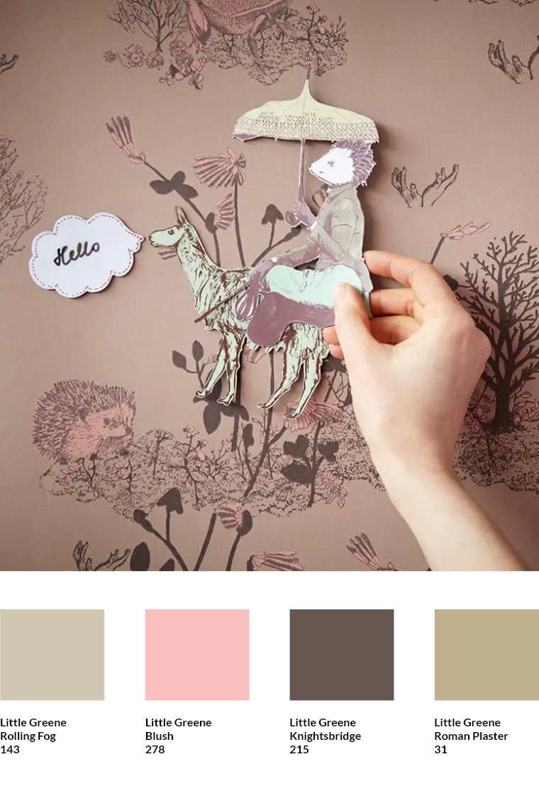
Woodland wallpaper by Sian Zeng. Sian Zeng also offers matching magnets.
5. Dino / Yellow Green
Our Dino Yellow Green wallpaper is often celebrated for its unique blend of vintage charm and contemporary style. The four colours I've selected from Little Greene - White Lead Deep, Sage Green, Citrine, Boxington, and Olive - each contribute to this nostalgic yet modern aesthetic. White Lead Deep is ideal for ceilings or adjacent walls, offering an airy and fresh appearance. For those seeking a darker, more intimate setting, Sage Green or Olive are perfect choices, especially in rooms used for projectors or video games, where minimizing light pollution is key.
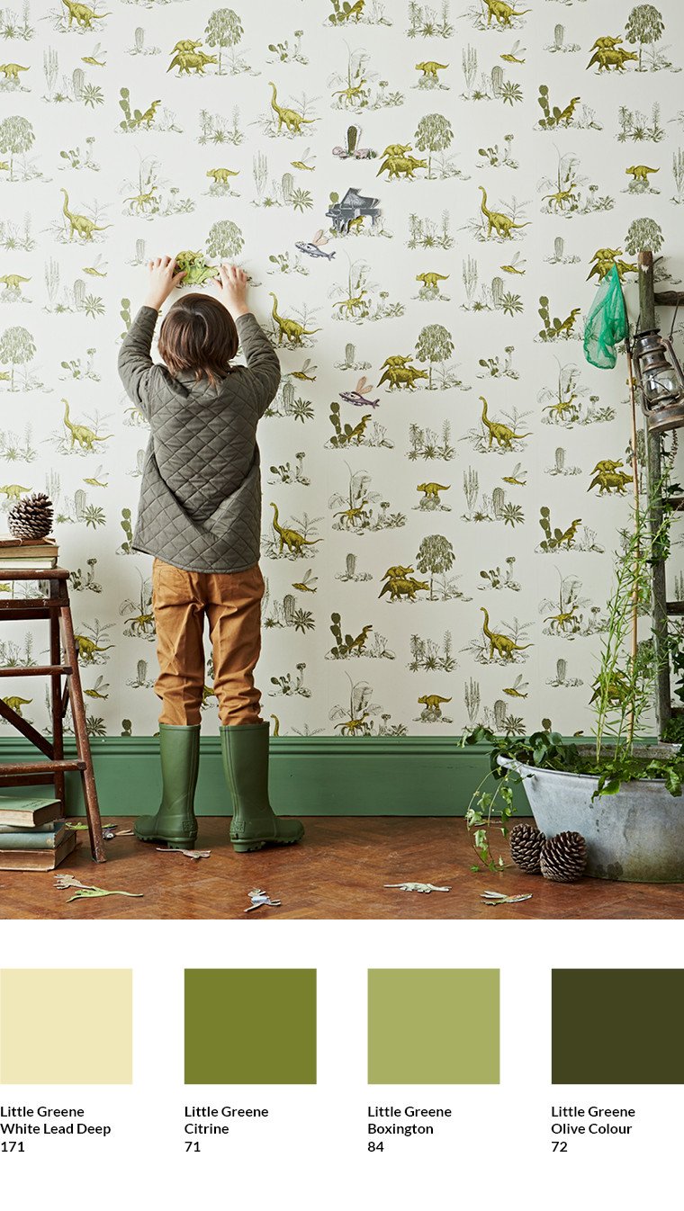
Dino / Yellow Green wallpaper by Sian Zeng
6. Dino / Grey
The Dino wallpaper in grey is very versatile, with grey being a colour that is easy to compliment nearly every other hue. Serpentine and Mushroom by Little Greene serve as two neutral options that simplify the colour palette, contributing to a minimalist aesthetic. Introducing Light Gold, whether on furniture or as an accent wall, injects modern vibrancy and energy into the space. Additionally, Blush can soften the grey tones, creating a warmer, more inviting atmosphere.
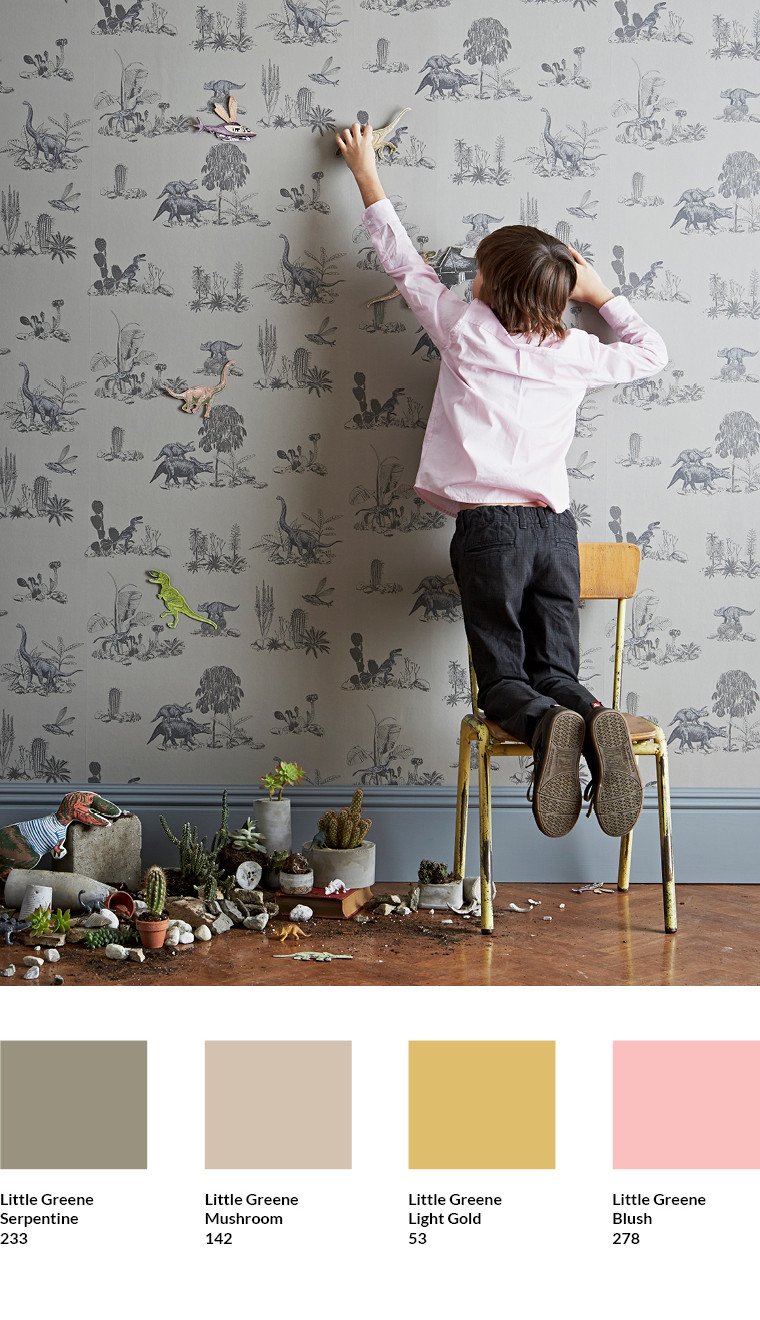
Dino / Grey wallpaper by Sian Zeng
Are you wondering how you can make a wall magnetic to use the magnets by Sian Zeng?
Have a look at the instructive article in the knowledge base of meinewand.com.
>> Discover the magnets by Sian Zeng at meinewand.com

Subscribe to the MEINEWAND blog
Never miss another blog post again!
We'll keep you informed by e-mail of each new blog post.

Picture Source: Sian Zeng