Finding the right combination of wallpapers and colours is a major challenge in wall design and colour consulting. At the same time, it makes a decisive contribution to creating a coherent room concept in the end.
As a master interior decorator, I have been developing colour concepts for individual rooms or entire properties for years. When matching the colour tones of our manufacturers to the wallpapers and murals from MEINEWAND, I like to use the following 3 approaches, which I also combine in many projects.
Pick up the colours of the wallpaper
Picking up selected shades of the wallpaper and painting the other walls of the room, the doors and furniture with them ensures a homogeneous interplay between wall and wallpaper. To find the appropriate shades, I work with the original colour charts of the paint manufacturers and samples of the wallpaper. Some wallpaper manufacturers also offer their own wall and furniture paints whose formulation is adapted to the printing inks of the wallpaper.
Using original colour cards and wallpaper samples is important because it allows me to ensure that the colours I choose exactly match the shade that will later be used on the wall, door or piece of furniture. In addition, the combination of wallpaper sample and colour card gives me the opportunity to assess the effect of the colour tones in different lighting conditions or at certain light incidence angles.
Select to match the colour spectrum of the wallpaper
Choosing colours for walls and doors that match the wallpaper can also mean finding shades that belong to the colour spectrum of the wallpaper. If the wallpaper colours are pastel shades, for example, colours that have the same pastel character will match.
Complement the colour spectrum of the wallpaper
A successful colour interplay between wallpaper, walls and furniture is also created when the colour spectrum of the wallpaper is complemented by the colours for the walls and furniture: A cooler colour spectrum of the wallpaper pattern, for example, can be completed by warmer wall colours. Wallpapers in strong colours can be complemented by restrained shades.
Cole & Son meets Little Greene
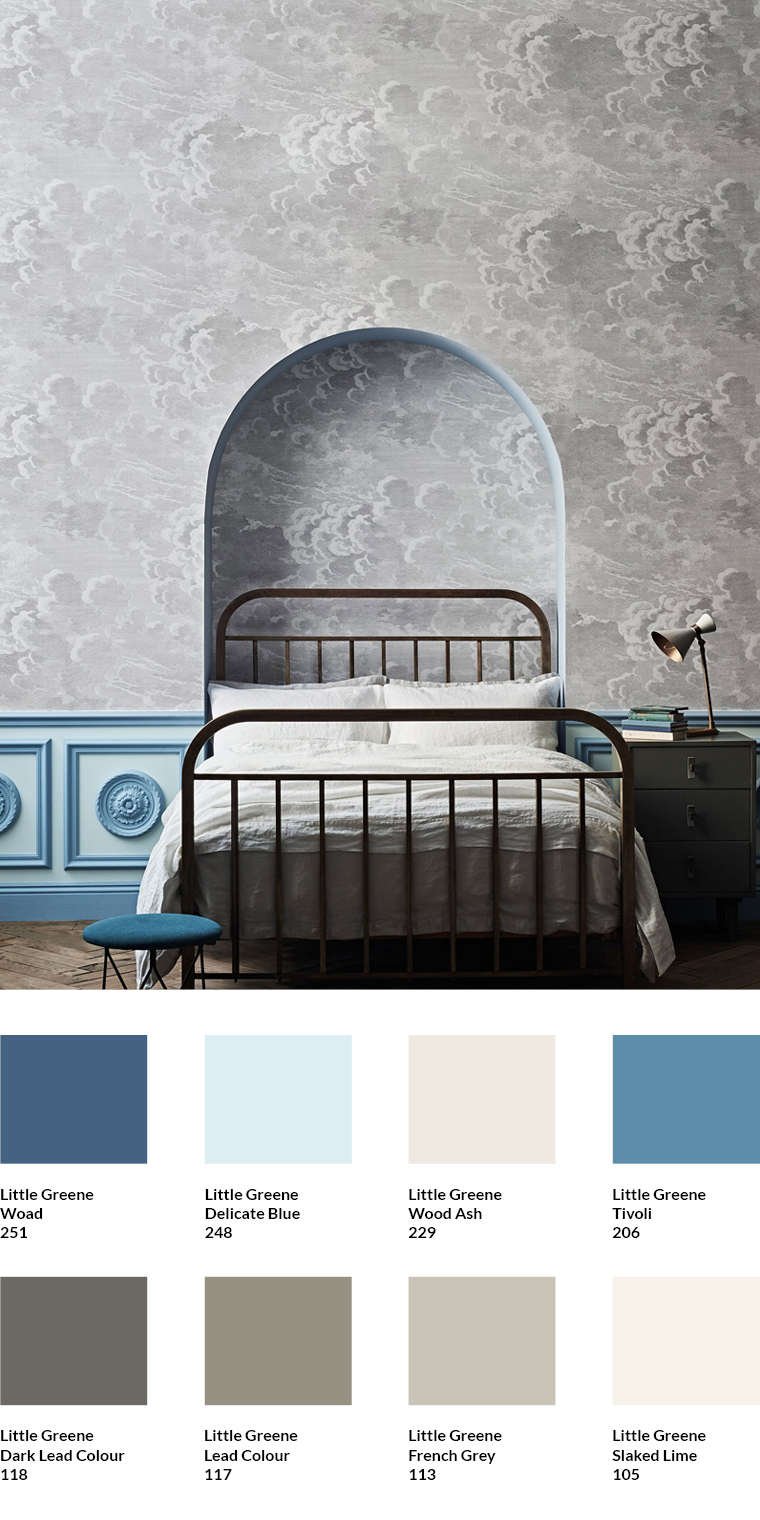
The elegant cloud design Nuvolette (1395.5) by Piero Fornasetti has been one of Cole & Son's most successful wallpapers for years. The dynamic pattern always delights me with its mix of cooler and warmer shades of grey. They can be picked up in the room and correspond to the shades Wood Ash, Slaked Lime, Frenchgrey and Lead Colour by Little Greene. The grey tones of the clouds can be combined with blue tones, which corresponds to the combination found in the sky. Delicate Blue and the eye-catching blue tone Tivoli simultaneously provide splashes of colour in the room. The darker shade of blue Woad, as used in the cover of the stool, matches this. The Dark Lead Colour of the bedside cabinet creates a connection between the brown tone of the parquet and the Lead Colour of the wallpaper.


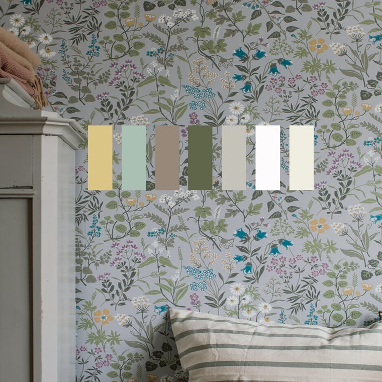
Scandinavian Floral Wallpaper Meets Farrow & Ball
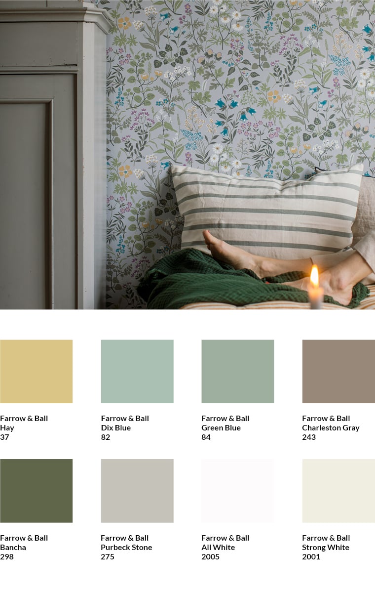 The wallpaper Flora (9382.4) by Boråstapeter brings the vintage atmosphere of Swedish country houses into the room. The eight colour tones by Farrow & Ball that I matched to the wallpaper pick up on the somewhat cooler tones of the wallpaper due to a slight grey component. The brown shade Charleston Gray and the green shade Bancha set warm accents in the room. The off-white shades are adapted to the wallpaper. Strong White also reinforces the vintage character of the wallpaper.

In the world of blue from Farrow & Ball

Despite the striking pattern of the Purnon wallpaper by Farrow & Ball, the room looks well balanced. The high skirting board and the striking frieze above the wallpaper are painted in the Farrow & Ball's dark blue colour Hague Blue 30. The colour is taken from the pattern of the wallpaper. It would also have been possible to opt for the lighter Pigeon 25 instead of Hague Blue, which matches the colour of the wallpaper background.
The white of the ceiling corresponds to Slipper Satin 2004, a classic Farrow & Ball white with a delicate grey-greenish hue that blends in with the wallpaper.
If you want to set contrasting accents, you can choose Preference Red 297 from the same manufacturer. The colour tone is intense and warm and matches the wallpaper's colour family perfectly thanks to its light blue tones.


Farrow & Ball Slipper Satin 2004

Farrow & Ball Preference Red 297
Homely elegance:
Arte International meets Farrow & Ball
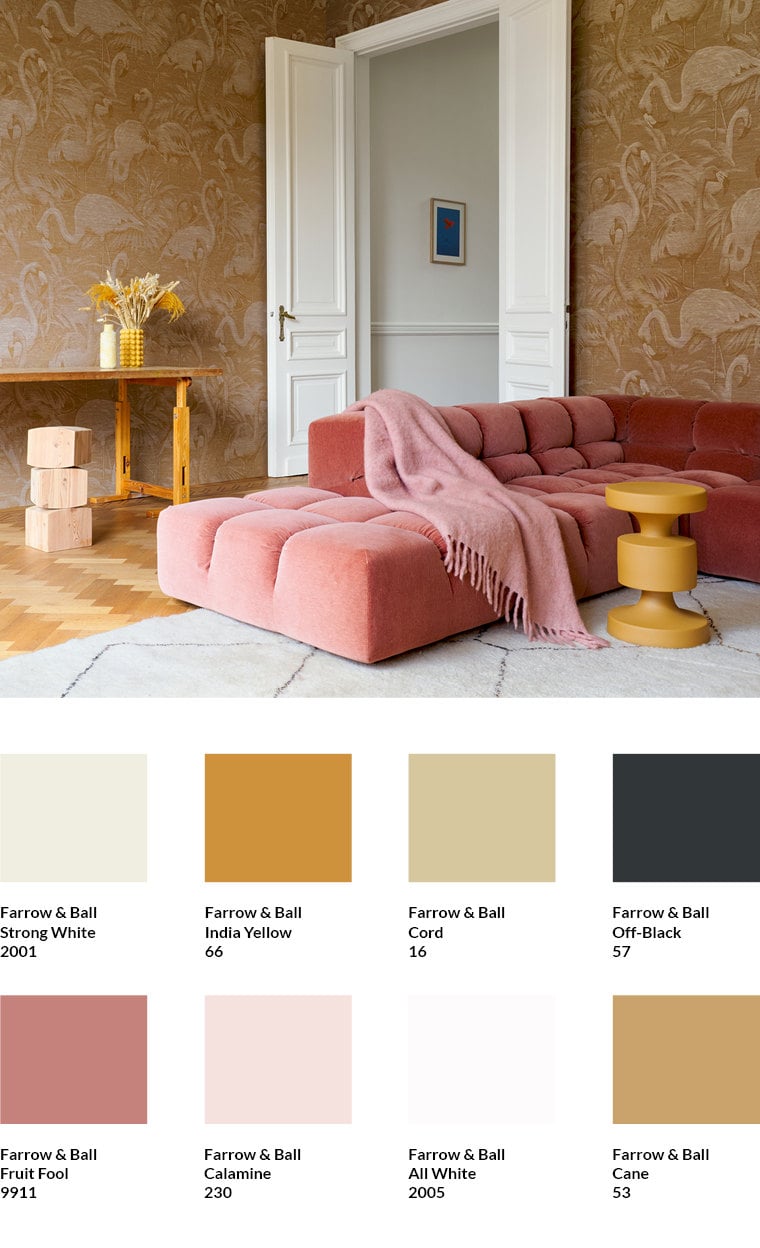
The Flamencos Andinos wallpaper from Arte (6146.3) brings luxurious design to the wall. The Indian Yellow by Farrow & Ball found in the wallpaper has a subtle vintage feel and is picked up by the round side table. Because of its position in the colour wheel, this strong shade of ochre goes well with the slightly pastel red or pink tones of the sofa and the blanket on top of it. They correspond to Fruit Fool and Calamine by Farrow & Ball.
The parquet harmonises with the tones Cane and Cord by Farrow & Ball, which appear in the wallpaper. The white of the door, which corresponds to the colour All White, is taken up by the grey-white of the carpet. Both counterbalance the warm browns, reds and yellows of the wallpaper and furniture. Another contrast, which I consider important, is provided by the off-black stripes of the carpet. It can be used in other places in the room if necessary.
Impressive depth effect:
Fish by Cole & Son meets Farrow & Ball
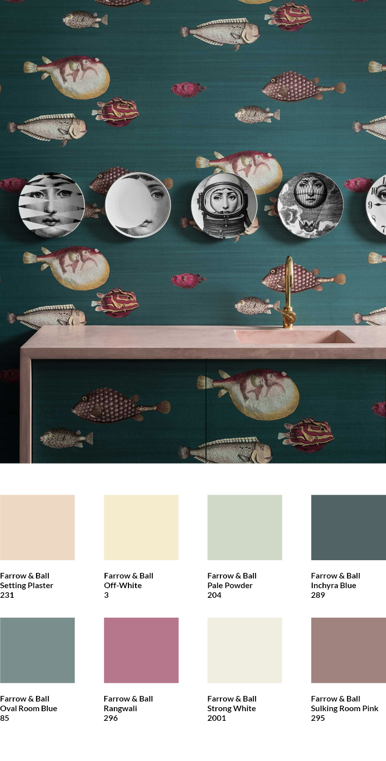
The Acquario wallpaper by Cole & Son (1403.5) in the shade Viridian is one of the best-known statement wallpapers by the traditional British brand Cole & Son. The mystical, calm, petrol-coloured background forms a contrast to the radiant variety of colours of the fish. This creates an enormous depth effect. At the same time, the colouring of the fish provides a large selection of matching shades for the room design.
To maintain the effect of the wallpaper as a statement in the room, a combination with the less intense Pale Powder or Off White from Farrow & Ball is a good idea. Both shades appear in the motif. For somewhat stronger designs, Sulking Room Pink is a good choice. Ranwali also picks up a shade from the wallpaper motif. Due to its intensity, however, it should be used in moderation. The washstand corresponds to the shade Setting Plaster by Farrow & Ball and shows how well more restrained tones from the wallpaper work in the room.
The colour of the background is Inchyra Blue. This can be used well in the room together with Oval Room Blue. However, care should be taken that the room as a whole does not become too dark.
Warm Grey: Josephine Munsey meets Little Greene
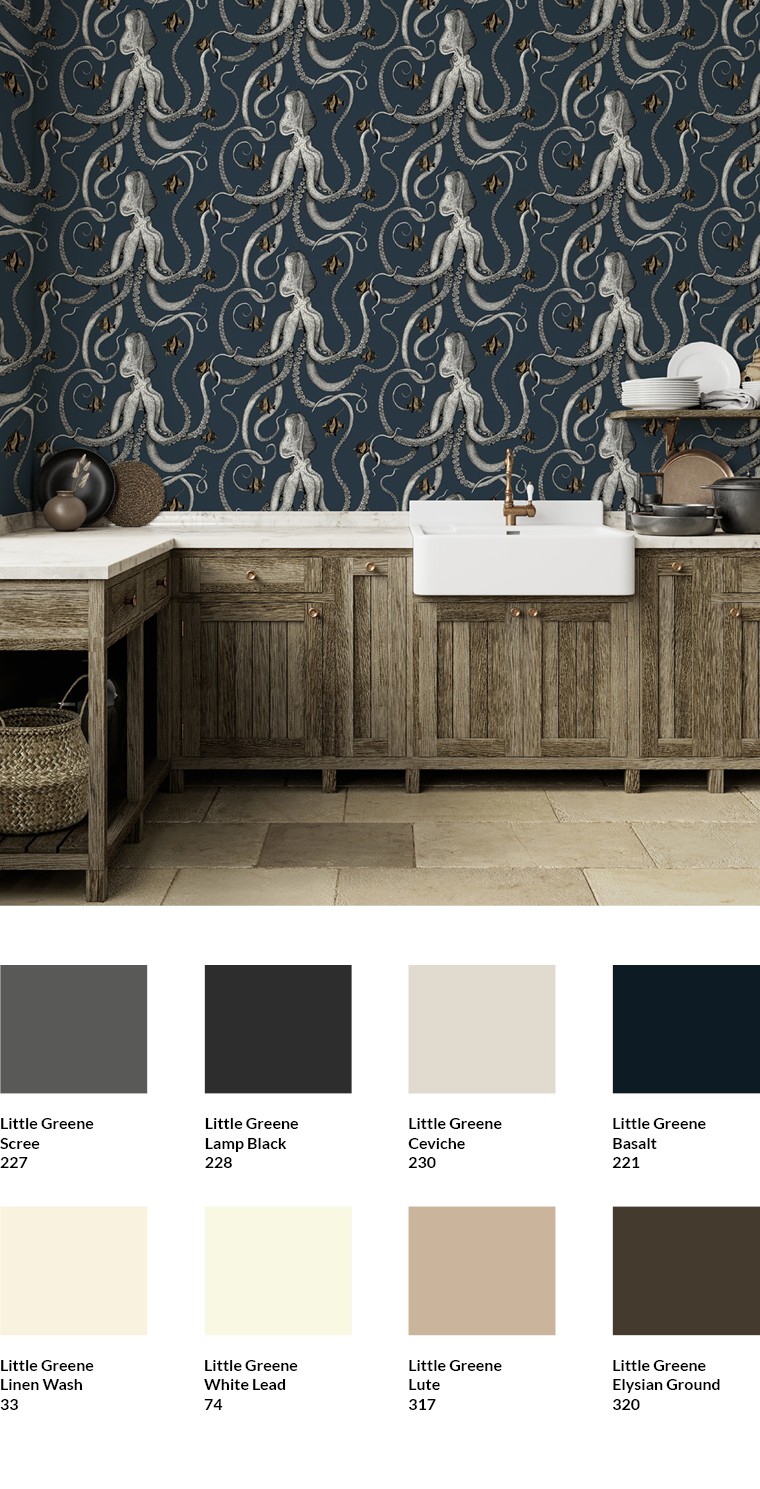
The secret of the Octopoda wallpaper by Josephine Munsey (8005.1) is, among other things, that the striking octopuses have been coloured in several warm shades of grey. Therefore, the wallpaper can be combined with the light grey shade Ceviche by Little Greene as well as with the warm shade White Lead by the English paint manufacturer. White Lead is also picked up by the worktop. The warm beige tone Lute matches the cabinets and the floor and appears in the wallpaper in the fish, which are also included in the motif. With Elysian Ground, a dark brown tone can also be used in the room, which is also included in the wallpaper.
The background of the wallpaper corresponds to Basalt by Little Greene. It can also be used in the room. As with the Acquario wallpaper by Cole & Son, however, care should be taken that the room does not become too dark overall as a result. The combination of the Octopoda wallpaper by Josephine Munsey with lighter colours also ensures that the enormous depth effect of the oceanic motif is enhanced.
Colour harmony by coordination

This room with the very lively Adelaide wallpaper from Farrow & Ball shows how well coordinated colours can create harmony and calm.
The solid bench was painted in a solid colour with Setting Plaster 231 from Farrow & Ball. The colour matches the background of the wallpaper. The piece of furniture thus recedes into the background without losing its position as a central object in the room.
Other colours that can be used are De Nimes 299 and Downpipe 26 from the same manufacturer. They are taken from the wallpaper. Dimity 2008 is a suitable white colour. The warm white tone harmonises perfectly with the background of the wallpaper.

Farrow & Ball Setting Plaster 231


Ei
n weiteres, beeindruckendes Beispiel für die beruhigende Wirkung von gut aufeinander abgestimmten Farben ist die Kombination der Tapete Barace von Farrow & Ball mit den Farbtönen Green Smoke 47 und dem helleren Lichen 19 des Herstellers. Beide sind dem sehr lebendigen Muster entnommen und bringen als unifarbene Wände Ruhe in den Raum.
Als passendes Weiß bietet sich School House White 291 an. Der traditionelle Weißton hat eine zarte beige-grünliche Note und schmiegt sich dadurch an die Farbtöne der Tapete an.
Wer mit weiteren, kleineren Flächen oder gestrichenen Möbeln zusätzliche Akzente im Raum setzen möchte, kann den Blauton Inchyra Blue 289 von Farrow & Ball nutzen. Er entspricht der Farbe des Sofabezugs.


Farrow & Ball School House White 291

Farrow & Ball Inchyra Blue 289
Intensifying colours in the wallpaper


Combining colours of different intensities is another strategy that creates colour-coordinated rooms. In this example, the Animal Kingdom wallpaper by Little Greene has been combined with Jewel Beetle 303 and Middlebuff 122 from the same manufacturer. Both the green and beige tones are the stronger versions of the colours found in the wallpaper.
The shelf and the wood panelling draw the eye. The intensification of the colour tones below the wallpaper makes the wallpaper recede into the room. Despite its lively pattern, it does not dominate the room, but creates a balanced mixture in combination with the stronger colour tones.
For other walls, colour tones of comparable intensity such as Pea Green 91 or Hammock 38 from Little Greene are ideal.
I recommend Stock 37 as a matching shade of white, which harmonises perfectly with the four colours mentioned.

Little Greene Jewel Beetle 303


Use colours from the wallpaper as a contrast

The typical English look of the kitchen is created by the deliberate contrast between the wall, window and furniture. The windows and furniture were painted in Hopper 297, a vibrant shade of green found in Little Greene's Spring Flowers wallpaper. The pink colour that dominates the wallpaper itself was deliberately not used. Instead, contrast was used to emphasise the windows and furniture while still harmoniously matching them to the wallpaper.
Similar effects could be achieved with Orange Aurora 21. If you prefer less contrast, you can combine the wallpaper with Garden 86 and Rolling Fog - Pale 158 from Little Greene.


Little Greene Rolling Fog - Pale 158
Embracing Marimekko's expressive world of wallpaper colours

This large-format panel featuring Marimekko's Unikko pattern, which the Finnish design brand launched to mark the 60th anniversary of its iconic floral design, stands out thanks to its intense green background. The bright motif, typical of Marimekko, influences the colours chosen for the room. The aim here was to stay within the striking colour palette of the wallpaper while deliberately softening its expressive effect.
On the wall to the left of the panel, Vert De Terre 234 by Farrow & Ball picks up the green of the wallpaper, but in a lighter shade. This adds freshness and tones down the green of the wallpaper, making it less dominant in the room. At the same time, Vert De Terre 234 appears warmer than pure white and makes the room even more welcoming.
On the wall to the right of the panel, Farrow & Ball All White 2005 was used to pick up the white tone from the wallpaper. It is neutral, light and fresh and goes perfectly with the wallpaper.
To add further accents to the room in keeping with Marimekko's design language, the intense green tone from the wallpaper is ideal, which corresponds to Beverly 310 by Farrow & Ball. Whether as fabric, as seen on the armchair, or as skirting boards, side tables or the colour for chair legs, it is extremely versatile.

Farrow & Ball Vert De Terre 234


The Kukkatori wallpaper, characteristic of Marimekko, also invites you to explore the Finnish manufacturer's colour palette. Sanderson's Bengal Red 90 was chosen for the chair and Gardenia Green 61 from the same paint manufacturer for the table. In contrast to the colours of the wallpaper, they have a slightly lower white content and therefore appear more intense than the wallpaper colours. This brings the furniture to the fore and makes the wallpaper appear more subtle despite its vibrant colours.
Marble White 1 by Sanderson is a suitable shade of white. It is taken from the background of the wallpaper and therefore goes perfectly with Kukkatori. When used over a large area in the room, for example to paint the opposite wall, it enhances the effect of the wallpaper because the contrast between it and the other colours in the wallpaper is very strong.


Sanderson Paint Gardenia Green 61

Sanderson Paint Marble White 1

Dreamland combined with Sanderson colours
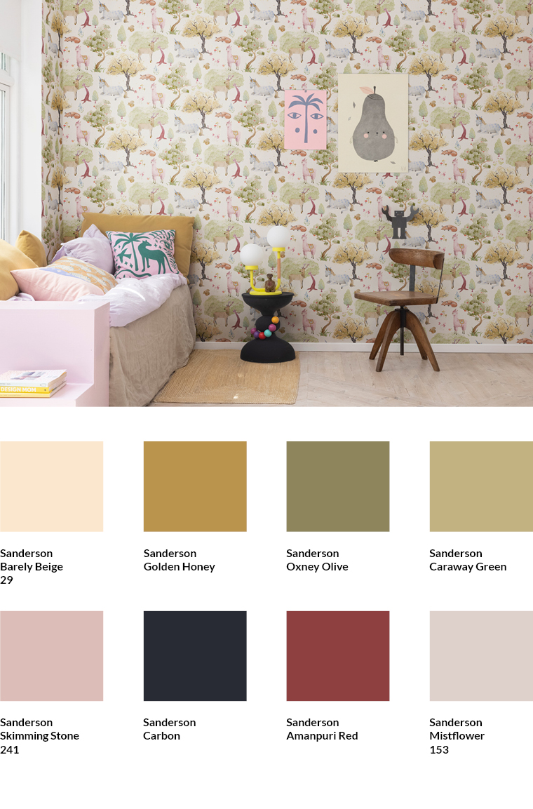
The wallpaper Dreamland (6678.1) by Boråstapeter convinces with perfectly coordinated warmer and cooler colours and many lovely details in the plants and animals depicted in the motif. In order not to change the balanced, calm effect of the wallpaper in the room, I initially chose shades from Sanderson that pick up colours from the motif. Barely Beige, for example, reproduces the colour of the background. Oxney Olive and Caraway Green pick up green tones from the trees. Golden Honey is also a shade found in the trees of the design. The yellow cushion on the bed is also coloured in Golden Honey. The horses in the motif contain the shade Mistflower, this is also picked up by the floor covering.
While these shades are based on the motif of the wallpaper, the small table in the shade Carbon sets a counterpoint. Even if this seems bold at first: a cleverly chosen colour counterpoint can round off a room with an otherwise very balanced colour concept.
Majvillan meets Little Greene
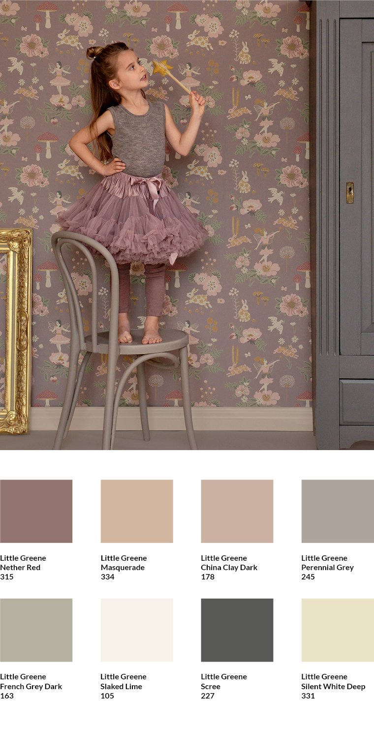
The Old Garden wallpaper by Majvillan (7276.1) is one of our most popular children's wallpapers. The pastel to subtle grey character of the pattern, which is typical for the Swedish manufacturer Majvillan, provides warmth and cosiness. It also lends the very expressive pattern a pleasant restraint.
The shades Nether Red, Masquerade and China Clay - Dark by Little Greene pick up the colour spectrum of the wallpaper with their brown and red content. The warm radiance of the wallpaper can be contrasted with the somewhat cooler grey of the shade Scree. In the photo, this is done by the cupboard. The off-white shade Silent White Deep picks up on the white tone of the motif.
Cole & Son meets Farrow & Ball

The Woods wallpaper by Cole & Son (1267.1) in its black and white colour scheme is one of the classics of the English brand Cole & Son. The room shows how well the iconic Mid-Century design of Woods goes with current furniture shapes.
The colour concept focuses on an elegant balance between cooler and warmer hues. The wallpaper already brings a pleasant basic warmth thanks to the off-white tone of its background. The green shade Green Blue of the worktop backsplash belongs to the rather cooler colour tones by Farrow & Ball. The grey shade Manor House Grey of the kitchen base cabinets, on the other hand, sets a discreetly warm accent. The organic pottery look of the crockery and vases, the natural brown wickerwork of the chairs and the green of the houseplants also provide a natural colour balance.
The colour of the tabletop and floor, which corresponds to the shade Cornforth White by Farrow & Ball, keeps a low profile and leaves enough visual scope for the wallpaper to unfold. As further colour tones, the background tone of the wallpaper, which is very close to Strong White by Farrow & Ball, or the dark grey of the tree motif (Off-Black by Farrow & Ball) could be picked up in the room if required.
English colour concept with a cool accent

The Home Park wallpaper by GP & J Baker, with its spring-like green tones, was used here with a subtle yet sophisticated colour scheme typical of English interior design. Little Greene Silent White - Mid 330 was used to the left of the wallpaper. This particularly warm shade of white was taken from the wallpaper and complements it perfectly. The colour is neutral and understated, yet intensely homely.
Bone China Blue 107 from the same paint manufacturer was used for the skirting board. The light blue shade with its slightly cool appearance is understated and visually limits the wall towards the bottom. At the same time, it balances the yellowish-green warmth of the other colours in the room. It has a balancing effect and adds a fresh touch.

Little Greene Silent White - Mid 330

Little Greene Bone China Blue - 107
Restrained pattern meets Little Greene
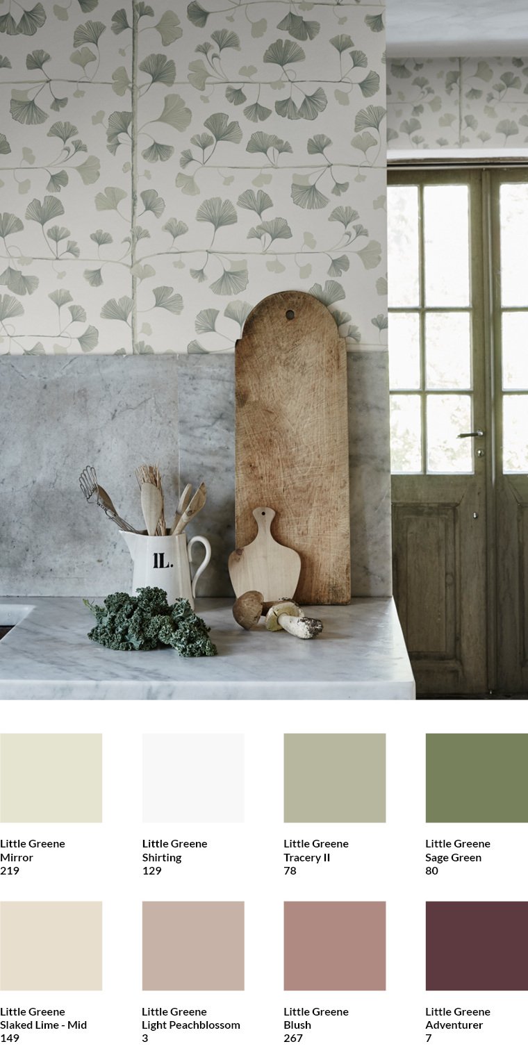
The Gingko wallpaper by Sandberg (4268.1) is typically Scandinavian in its restraint. With the green tones Mirror, Tracery and Sage Green by Little Greene, the colours of the leaves can be picked up in the pattern of the wallpaper. The colours are altogether more subdued than in the Pine wallpaper by Sandberg, which I present to you here. The door on the right in the picture shows how well the combination with Sage Green works.
The background of the wallpaper corresponds to Shirting by Little Greene. The shade can be used on another wall. The marble shade of the washbasin corresponds to Slaked Lime Mid. It too is suitable for another wall in the room.
If a complementary colour accent is needed in the room, it can be created with Adventurer, Blush and Light Peachblossom from Little Greene. When all three shades are used, this ensures that the effect of the shades as a solitary colour is softened as they form a coherent overall ensemble.
Both the accent shades and the shades of the wallpaper pattern appear coherent in their interplay, as they all have a slight grey component. This is also the reason why the washbasin blends in well with the room.
Scandinavian Wabi-Sabi Wallpaper Meets Farrow & Ball
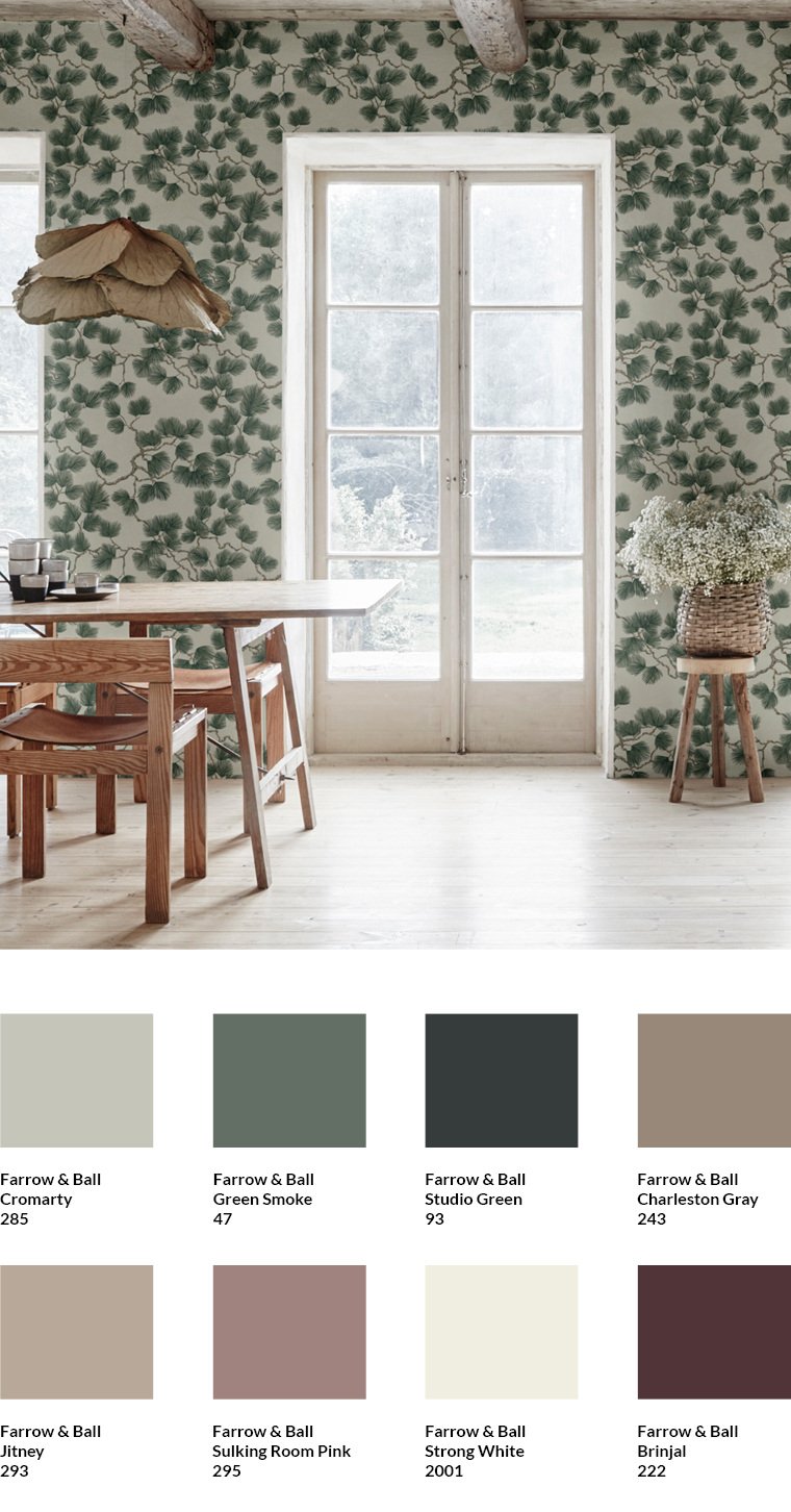
The Pine wallpaper by Sandberg (4260.3) has a somewhat stronger colour scheme than the Ginko wallpaper by the same manufacturer that I am presenting here. Nevertheless, it too exercises Nordic restraint and is inspired by the Japanese wabi-sabi principle.
The colour of the background can be picked up with the shade Cromarty by Farrow & Ball. Green Smoke and Studio Green correspond to the colours of the pine needles. Charleston Gray and Jitney pick up the colour of the branches in the wallpaper pattern. Both colours are found in the wooden furniture and the wooden ceiling.
Apart from these shades, only off-white tones are present in the room. Strong White corresponds to the colour tone of the windows and the floor. It can be used anywhere else in the room if necessary.
A colour accent can be set with Light Peach Blossom and Brinjal. Using both shades together ensures that their effect as a solitary colour is softened, as they form a coherent overall ensemble.
Strong dark tones meet Farrow & Ball
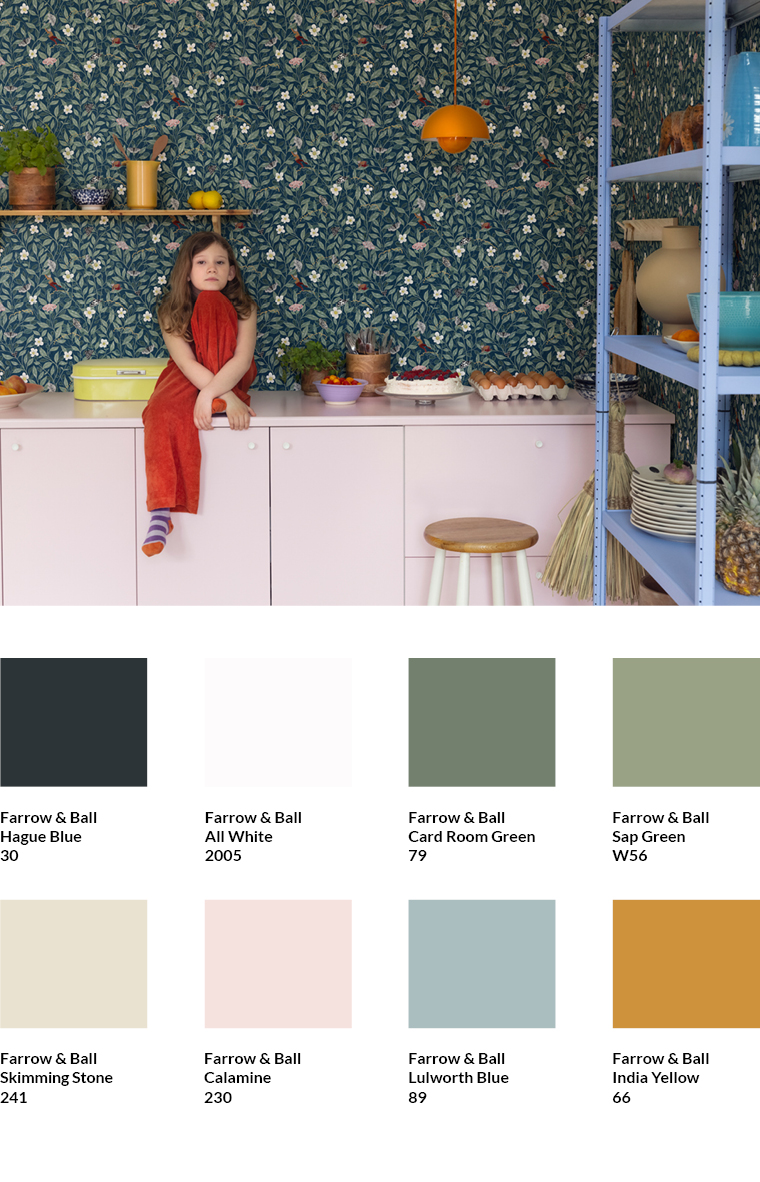
The Pixie Shore wallpaper by Rebel Walls (6683.3) is very expressive in the Night colour scheme. Despite the strong, dark colours of the background, it can be excellently combined with All White by Farrow & Ball, as this shade appears in the flowers of the wallpaper. The dark background itself corresponds to Hague Blue by Farrow & Ball, the green leaves correspond to Card Room Green and Lichen. Skimming Stone can be used as a balancing neutral tone in the room; it also appears in the flowers.
The subtle pink Calamine shade of the base unit, the intense light blue Lulworth Blue and the yellow (Indian Yellow) of the lamp and shelf have no direct connection to the colour tones of the wallpaper pattern. They therefore draw attention to themselves and can thus prevent the strong wallpaper shades from unintentionally strongly dominating the room.
Moooi meets Farrow & Ball
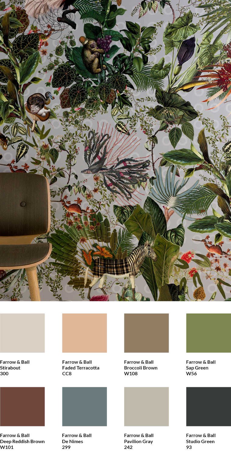
The Menagerie of Extinct Animals wallpaper by Moooi (5268.3) always inspires me with its luxurious fabric material, which is applied to a non-woven backing during production. The motif brings floral jungle elements in natural colours to the wall. In the room, the green tones can be picked up with Sap Green and Studio Green from Farrow & Ball. A brown shade such as Deep Reddish Brown, as it appears in the wallpaper, can also be used for other walls or the interior. The chair upholstery in the shade Broccoli Brown also harmonises very well with the wallpaper. The cooler grey Pavilion Grey of the background, enlivened by small circles alluding to the letter O of the Moooi brand, can be complemented in the room by the warmer neutral shade Stirabout by Farrow & Ball.
Nordic tones: A Swedish classic meets Little Greene
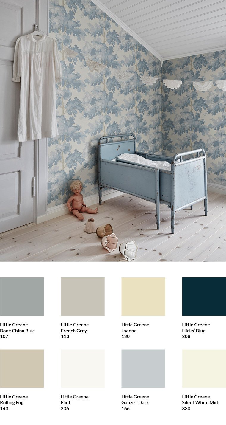
The Raphael wallpaper (2053.3) from Sandberg brings a calm, typically Scandinavian mood into the room with its restrained, rather cool blue tones. The natural, floral leaf motif ensures that the walls nevertheless appear pleasantly soft and homely. This is supported by the knotty parquet flooring and the warm grey tone French Grey by Little Greene, which matches the colour of the door and the door frame. A warmer shade such as Silent White Mid also goes well with the skirting board.
Bone China Blue, Gauze Dark, Joanna and Rolling Fog by Little Greene pick up the tones of the wallpaper and can be used on furniture. In the photo, Bone China Blue was used for the bed. For the ceiling, on the other hand, a brighter white was used with the colour Flint by Little Greene. This corresponds with the cooler tones of the wallpaper.
Combine gold-coloured wallpaper with dark colours
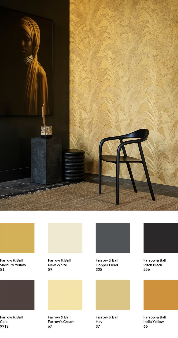
The Musa wallpaper from Arte International (1830.1) is one of the most popular golden wallpapers from MEINEWAND. The intricately embossed, slightly raised surface of the vinyl wallpaper and metallic pigments create interesting shadow and shine effects depending on the incidence of light.
The metallic gold tones of the wallpaper correspond to the Sudbury Yellow, India Yellow and Hay shades from Farrow & Ball. These are yellow shades without metallic pigments. However, their colour tones correspond exactly to those of the wallpaper. I advise against using colours with metallic pigments, as offered by some manufacturers, because they cannot be tinted exactly to match the colour tones of the wallpaper.
The photo shows how well a gold-coloured wallpaper can be combined with dark brown to black shades. The result is a contrasting, luxurious interior. At the same time, the contrast is not as strong as with a combination of white wallpaper with dark brown or black tones.
The shade Cola by Farrow & Ball corresponds to the colour of the carpet, Pitch Black corresponds to the wall and the chair. The half-height column and the floor correspond to the shade Hopper Head.
If you still find the combination of the wallpaper with dark tones too contrasting, you can combine it with Hay or New White instead. New White corresponds to the decorative accessory on the column and is also suitable for the colour scheme of the ceiling of the room.
Combine gold-coloured wallpaper with light colours
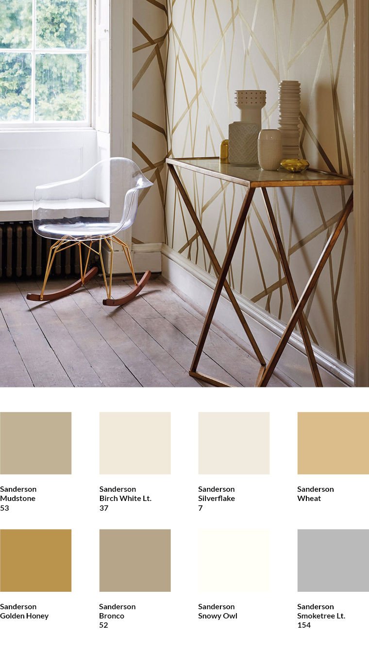
The wallpaper classic Sumi (5928.6) is also produced by the English manufacturer Harlequin in a gold-coloured variant. The lines are softly designed as brush strokes, the light background has a subtle two-tone canvas look, which reduces the contrast to the actual motif.
Combining gold tones with light colours gives rooms a completely different feel than combining gold with dark colours: Combined with light colours, gold unfolds a warm effect in the room.
The golden yellow tones Mudstone, Wheat, Golden Honey and Broncho by Sanderson come from the wallpaper and are picked up by the colours of the table, the porcelain items and the wood of the chair. Those looking for an additional shade of white can pick up the colours of the wallpaper background with Birch White LT and Silver Flake. Deviating from this, Snowy Owl can also be used. This is used for the skirting board. Another matching shade that can be chosen as a complement is the grey of the Smoketree Lt. floor.
Powerfully restrained

The Woodland Chorus wallpaper by Sanderson (2466.2) is one of the most popular wallpaper motifs in our shop. The muted background tone, which corresponds to Pale Powder by Farrow & Ball, softens the stronger hues of the motif well.
The Sudbury Yellow shade of the chair also appears in the wallpaper motif. The round tray on the tabletop corresponds to Dix Blue by Farrrow & Ball and matches the pale green tone of the wallpaper background. I took the orange shade Charlotte's Locks from the wallpaper motif. It can be used in the room as a matching accent tone.
The colour of the tree trunks, the table top and the floor contain the warm Stony Ground by Farrow Ball. All the shades used have a slight green component, just like the colours of the wallpaper. This common denominator brings calm to the room and places the motif of the wallpaper in the centre.
Find matching colours in the MEINEWAND shop
In the MEINEWAND shop I have already put together matching shades for many wallpapers. You will find them below the wallpapers.
Subscribe to the MEINEWAND blog
Never miss another blog post again!
We'll keep you informed by e-mail of each new blog post.

- Discover Farrow & Ball colours at MEINEWAND
- Discover Little Greene colours at MEINEWAND
- Blog post: New neutrals - warm colours for smart rooms
Image sources: Cole & Son (1, 7 ), Boråstapeter (2 ), Arte International (3, 9, 11), Harlequin (12), Sanderson (13), Rebel Walls (4, 8), Majvillan (5), Sandberg (10), Boråstapeter lead story