Warm colours create an inviting, cosy atmosphere in rooms and are perfect for creating a homely feel. As a wall paint, these shades have both an invigorating and stabilising effect on interior design. As part of a collaboration with Westwing, Sebastian and Kai from MEINEWAND have put together inspiring colours from our English manufacturers for rooms from Europe's largest interior supplier.
As part of our cooperation with Westwing, we are dedicationg a multi-part series to wall and room design with colours. The second part focuses on warm colours.
The colour wheel contrasts warm and cool colours. Cool colours include blue and green, which have a refreshing, calming effect. The warm colours include passionate red, soft pink, vibrant orange and radiant yellow. But the soft sand and earthy tones also belong to this category. What they all have in common is that they lend rooms an inviting atmosphere.
Warm wall colours create a harmonious overall picture in your home. Neutral, warm tones such as brown and beige are ideal for use on large surfaces. More expressive shades such as warm red, on the other hand, should be used specifically as accent colours. The brightness of the colour tones also plays a decisive role in the choice of colour: Dark, warm colours such as dark brown lend large rooms more cosiness, while lighter shades visually enlarge small rooms.
Neutral, warm colours such as brown, beige and cream radiate a calming atmosphere and offer a stylish alternative to the classic white wall design. Their neutrality provides the perfect backdrop for very different interior design styles.

The colour tones in the photos:
Stirabout 300 and Dead Salmon 28 from Farrow & Ball were combined for this room: The neutral grey-brown tones have a pronounced red undertone. This makes them warm and cosy and modern at the same time.
1. Sand tones
The colour sand offers a neutral alternative to white, without its cool effect. Timeless and light, it lends walls a pleasant lightness and blends harmoniously into almost any interior design style. Its versatility makes it easy to combine with other colours. For a Scandinavian look, sand tones can be perfectly combined with grey and light wood.
The colour tones in the photos:
Stone II 202 from Paint & Paper Library is a restrained neutral shade that radiates warmth and can be used in a variety of ways. Combined with the pink colour Powder II 292, the effect is enhanced even further (left photo).
The strong sand shade Barbican 249 from Paint & Paper Library creates a clear look that is very modern with its light grey tones (right photo).
2. Dark earthy tones
Dark earthy tones are among the warmest shades of wall colours and create a cosy, inviting atmosphere. Dark brown is characterised by its elegant appearance and at the same time conveys a pleasant naturalness. This effect allows for a harmonious combination with other warm and neutral colours. Cream and sand tones in particular, as well as golden accents, emphasise the warm character of the room. Shades of red can also come into their own as colour partners. It is advisable to use lighter shades of red to lighten up the combination with brown and avoid an oppressive overall look.
The colour tones in the photos:
The strong grey-brown Grape from Zoffany has a slight red component that makes the room cosy (left photo). The terracotta colour Red Earth 64 from Farrow & Ball radiates naturalness (right photo).
About Westwing
Westwing is the leading online vendor of high-quality inspirational furniture and accessories in Germany and has been highly successful in 11 European countries since it was founded in 2011. Westwing's inspirational pages contain countless ideas on the subject of interior design.
3. Coral red

Coral red gives walls a warm and refreshing touch. The vibrant colour is ideal as an accent colour in interior design. Coral red looks particularly stylish in combination with white or red furniture and accessories, which harmoniously round off the overall look.
The colour tones in the photo:
Book Room Red 50 from Farrow & Ball is a terracotta colour in a particularly strong and expressive variant. It is ideal for an accent wall that radiates warmth.
4. Yellow and gold

Many yellow tones also belong to the warm nuances of the colour palette and lend rooms a fresh yet unobtrusive radiance. Thanks to its subtle vibrancy, yellow can be wonderfully combined with luxurious tones and materials. Golden accessories in particular harmonise perfectly with yellow walls and create an elegant and stylish look when combined with white.
The colour tone in the photo:
Golden Honey from Sanderson is an intense yellow gold that is used in an accentuated way, for example to give white furniture a sophisticated and cosy setting.
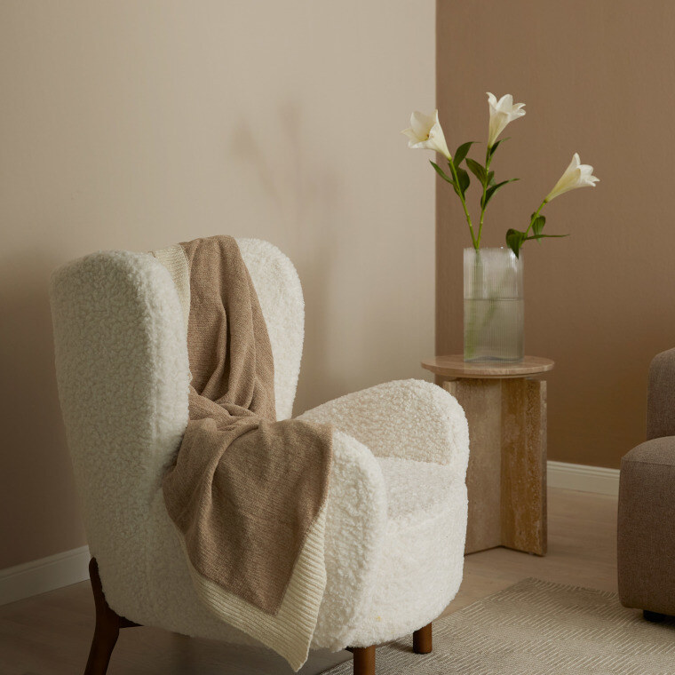
5. Warm colours in the bedroom
In the bedroom, we long for peace and harmony. Light, warm colours are particularly suitable for creating a relaxed atmosphere. Dark colours lend the room an elegant touch, but should only be used in larger rooms. Intense, warm wall colours are not advisable in the bedroom, as they can quickly create a restless overall picture. Instead, appropriate accents should be created using furniture or home accessories.
The colour tones in the photos:
The timeless, sophisticated pink shade Mochi 344 from Little Greene is both warm and modern (left photo).
Stirabout 300 from Farrow & Ball is a very warm neutral shade with a grey undertone (right photo).
6. Warm colours for the living room
Cream or beige-coloured walls also create a bright and friendly atmosphere in the living room. The room looks inviting and open. Eye-catching pieces of furniture in bold colours are particularly effective against this background and set accents. A terracotta-coloured wall radiates soothing warmth and gives the living room a touch of oriental flair.
The colour tones in the photos:
The particularly warm grey Dusk from Zoffany creates a modern atmosphere.
Tuscan Red 140 from Little Greene is a warm terracotta colour that is very bold and yet restrained at the same time.
7. Warm wall colours for the dining room
Warm, harmonious wall colours are ideal for the dining room, as they create an inviting and welcoming atmosphere. Fresh colours are particularly appealing. A dining room in beige, combined with natural materials and black accents, looks modern and radiates calm at the same time. An accent wall in a warm terracotta shade also fits perfectly in the dining room and gives the room a cosy touch.
The colour tones in the photo:
The earthy pink Masquerade Light 332 from Little Greene decorates rooms with its restrained red colour.
The dusky pink Blush 267 from Little Greene radiates modern warmth.
8. Warm wall colours for the children's room
Warm wall colours are also an excellent choice for the children's room. However, they should be subtle and not too bright, as toys in children's rooms are often already very colourful. This creates a harmonious and cosy environment.
The colour tones in the photo:
The rich orange-brown Galette 340 from Little Greene radiates a solid, calm atmosphere in the room.
Caddie 452 from Paint & Paper Library is a strong sand colour that can be combined in a variety of ways and radiates calm and warmth.
You might also find this interesting
Part 1 of the Westwing x MEINEWAND series:
Subscribe to the MEINEWAND blog
Never miss another blog post again!
We'll keep you informed by e-mail of each new blog post.

Photos: Westwing