If you combine wallpaper and interior in a contrasting way, you create freshness and liveliness in the room. This is easy with the right choice of wallpaper and colour.
High-contrast design follows rules.
High-contrast colour design does not mean combining colours and wallpapers arbitrarily. Here too - as with any colour concept - there are some basic rules. In this blog post, I will show you how you can design contrasting rooms in a coherent way despite all the liveliness.
Using wallpaper as a link between furniture and colours
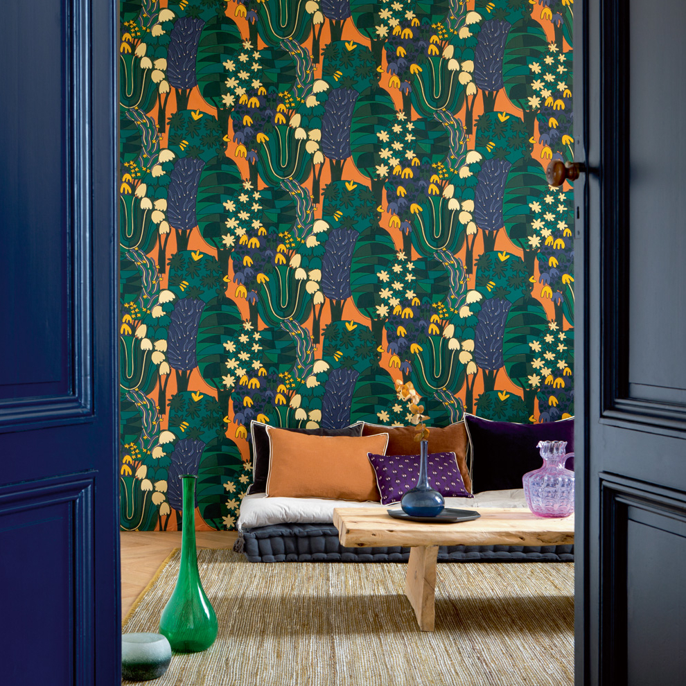
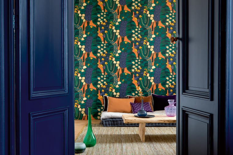
Wallpapers that themselves work with strong colour contrasts can serve as a hinge between colour-painted surfaces in the room and the furniture. The example of the wallpaper Broceliande by Élitis (colour scheme 7820.1) shows this well. Strong contrasts are already present in the wallpaper itself, as it combines monochrome dark blue-green tones with orange. The door and other elements in the room pick up colour tones from the wallpaper. The wallpaper becomes, so to speak, the linchpin of the high-contrast design.
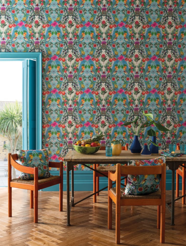
The colour scheme of the Talavera wallpaper by Osborne and Little (colour scheme 4217.1) also follows this concept: the colour contrasts in the room appear coherent because the wallpaper that dominates the room is also very contrasting.
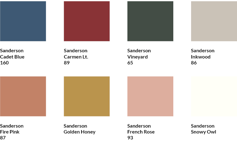
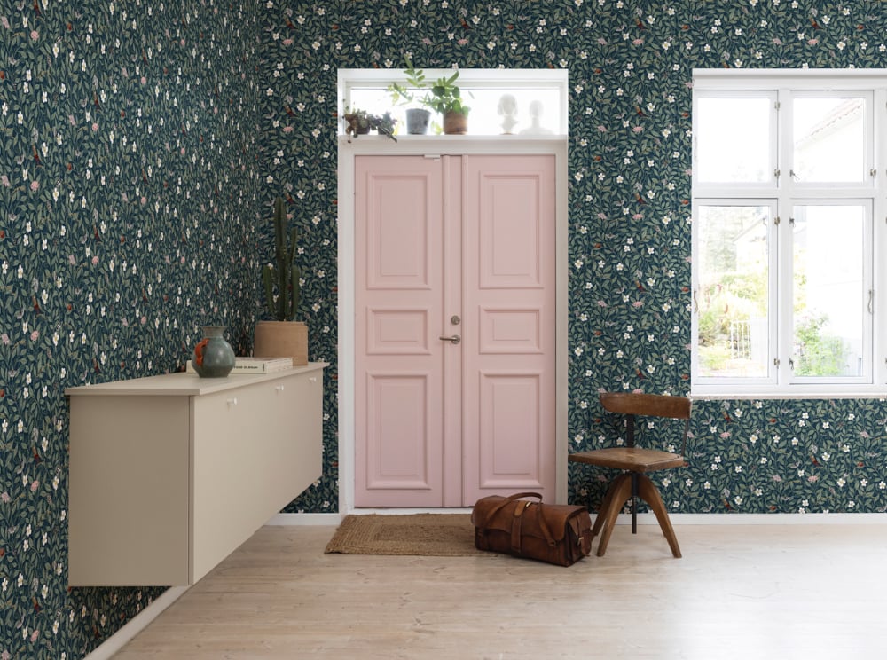
In the Forest of Dean wallpaper by Sanderson (colour scheme 9794.3), the skirting board and door have been implemented in the red tone of the wallpaper. This creates the same contrast at the transition from the wallpaper to the wood as within the wallpaper. At the same time, the monochrome wooden elements ensure order in the otherwise very lively room despite their strong colouring.
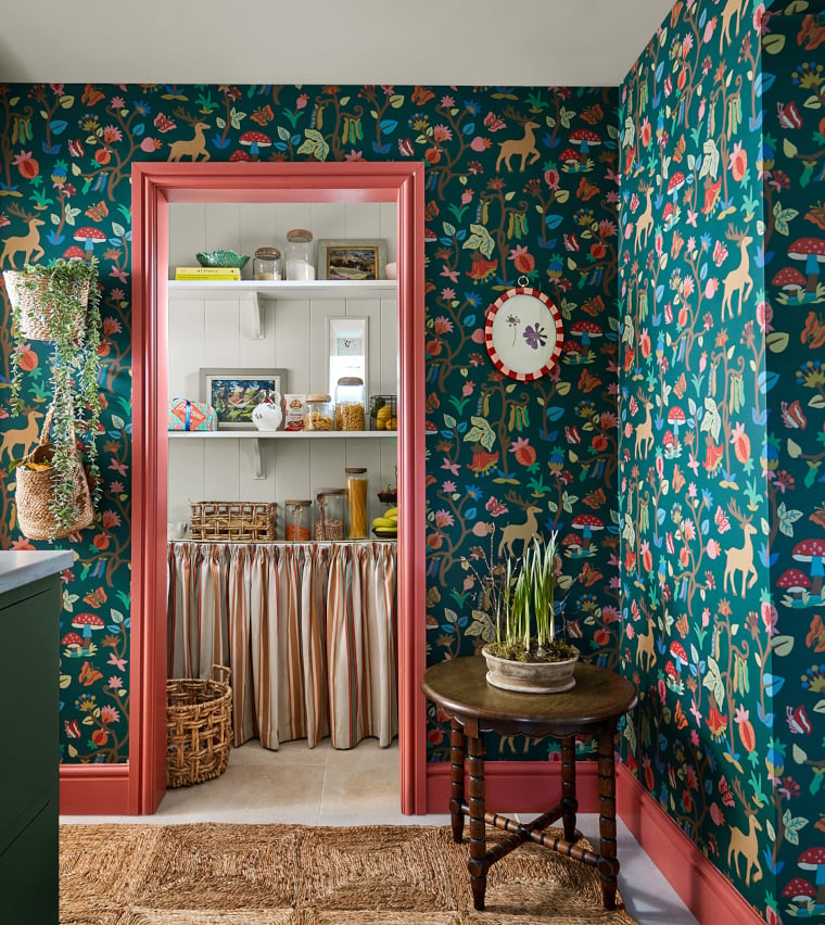
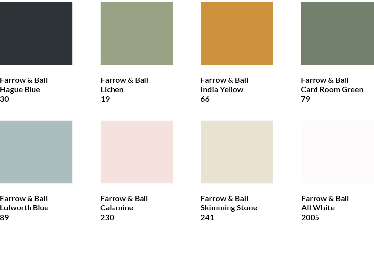
The Forest of Dean wallpaper can also be combined with the following Sanderson colours from our range:

Enhance contrasts of the wallpaper with colours
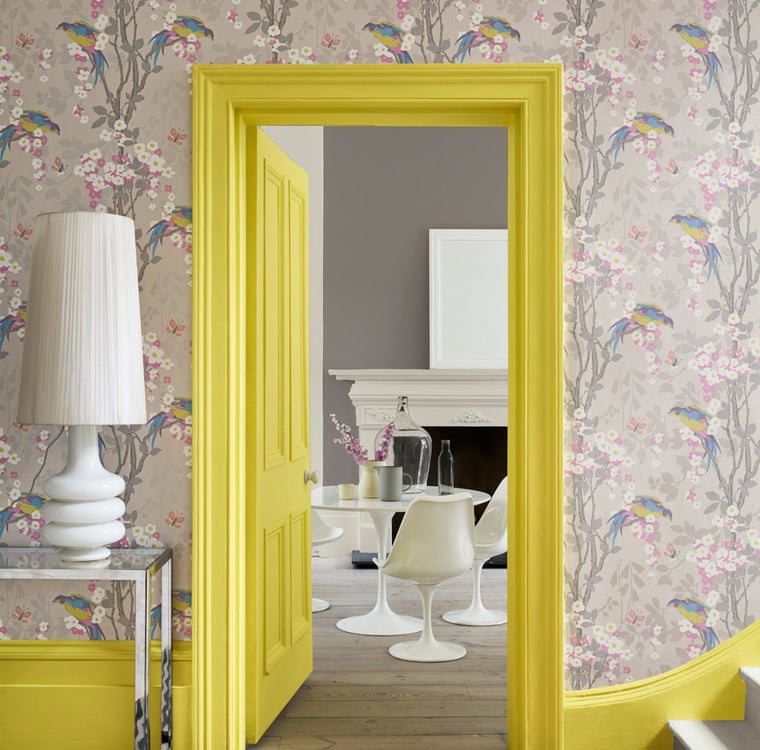
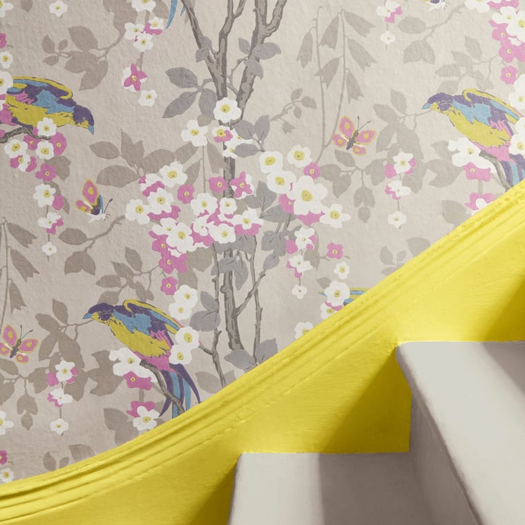
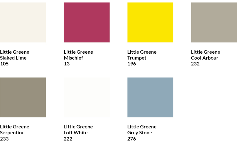
Another approach to a contrasting colour concept is offered by wallpapers that contain contrasting colour tones but do not make this too obvious. A good example of this is the Loriini wallpaper by Little Greene (colour scheme 3576.2). The wallpaper itself is on the whole rather calm and restrained in its colourfulness. The contrasting yellow of the birds only sets small accents that are hardly noticeable from a distance. Only by picking up the yellow tone through the door, frame and skirting board is the contrast emphasised and sets accents in the room.
Die Tapete Loriini lässt sich außerdem mit folgenden Farben von Little Greene aus unserem Sortiment kombinieren:

The same principle was implemented in the Pixie Shore wallpaper by Rebel Walls (colour scheme 6683.3). The use of the pink tone inconspicuously present in the wallpaper for the door emphasises the contrast between the muted green tone dominating in the wallpaper and the bright pink.
The Pixie Shore wallpaper can also be combined with the following colours by Farrow & Ball from our range:

Combine colour as a contrast to the wallpaper
A different kind of contrast is created when the shades used in the room and the shades of the wallpaper differ from each other. This is masterfully realised in the Bird and Anemone wallpaper by Morris & Co (colour scheme 9357.1): The yellow does not pick up any shade from the wallpaper, but is deliberately set as a contrast. As the two shades are complementary colours, the combination appears coherent despite the strong contrast. In contrast to the lively pattern of the wallpaper, the straight lines of the tongue and groove boards and their monochrome paint bring calm to the colour arrangement.
The Bird and Anemone wallpaper can also be combined with the following Morris & Co colours from our range:
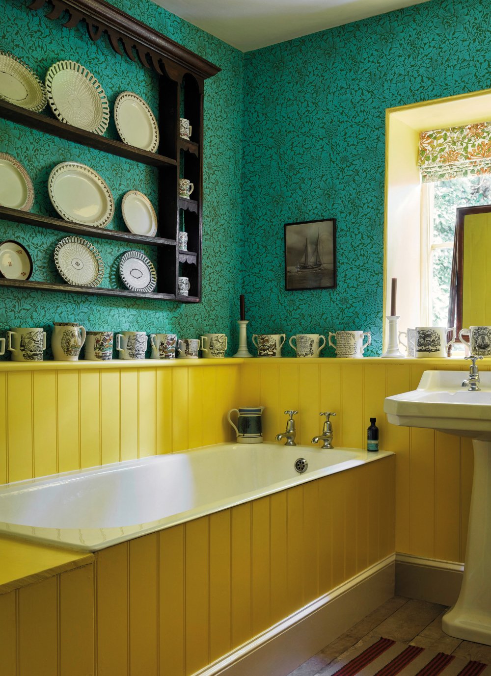
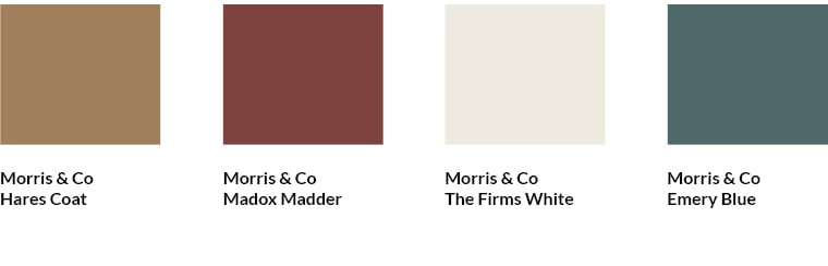
Complementary colours are also used in the Apple wallpaper by Morris & Co (colour scheme 5277.5). Therefore, the contrast is also harmonious here. In addition, blue tends to be perceived as a calm colour.
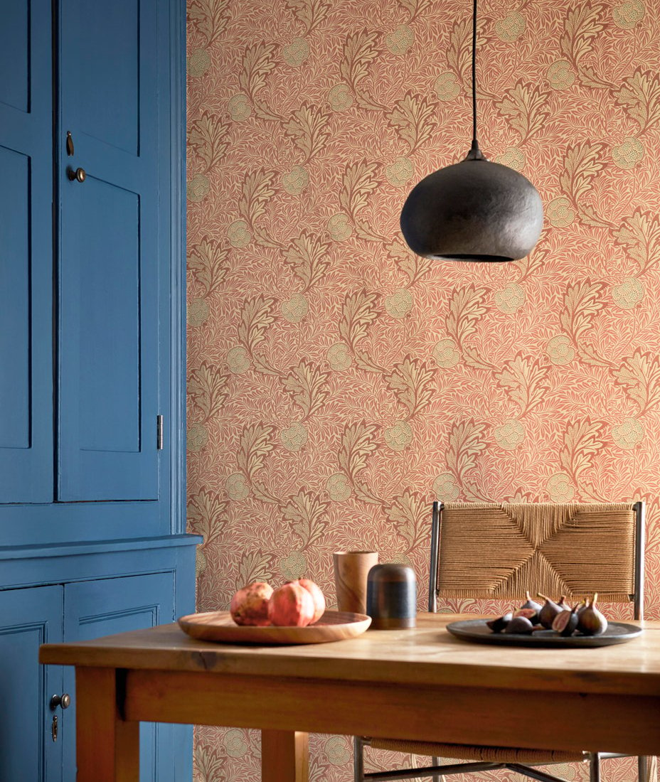
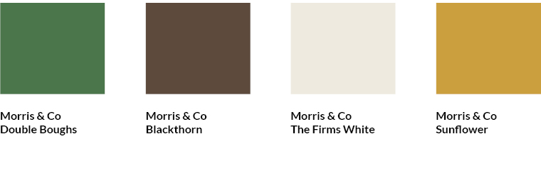
The Apple wallpaper can also be combined with the following Morris & Co colours from our range:
My advice for contrasting colour designs with wallpaper and paint: follow the rules and stay bold at the same time!
Find matching colours in the MEINEWAND shop
In the MEINEWAND shop I have already compiled matching shades for many wallpapers. You will find them below the wallpapers.
Subscribe to the MEINEWAND blog
Never miss another blog post again!
We'll keep you informed by e-mail of each new blog post.

- Discover colours by Farrow & Ball at MEINEWAND
- Discover colours by Little Greene at MEINEWAND
- Blog post: New Neutrals - warm colours for smart rooms
Bildquellen: Élitis, Osborne & Little, Sanderson, Little Greene, Rebel Walls, Morris & Co (2); Aufmacher: Élitis