Choosing the right colour for the ceiling is important for a harmonious room concept. However, when designing a room with colour, the focus is usually on the colour of the walls. The ceiling is often overlooked. In this article, I show you what you should consider when choosing the ceiling colour.
A simple, i.e. non-tinted white is usually chosen for the ceiling. The idea behind this is that it opens up the room and makes it appear higher. However, the effect is often exactly the opposite. Because if the walls are painted in colour or covered with coloured wallpaper, a bright white ceiling can have a rather limiting or oppressive effect.
In the following, I will introduce you to some concepts that incorporate the colour of the ceiling into the room design and have many advantages over white ceilings.

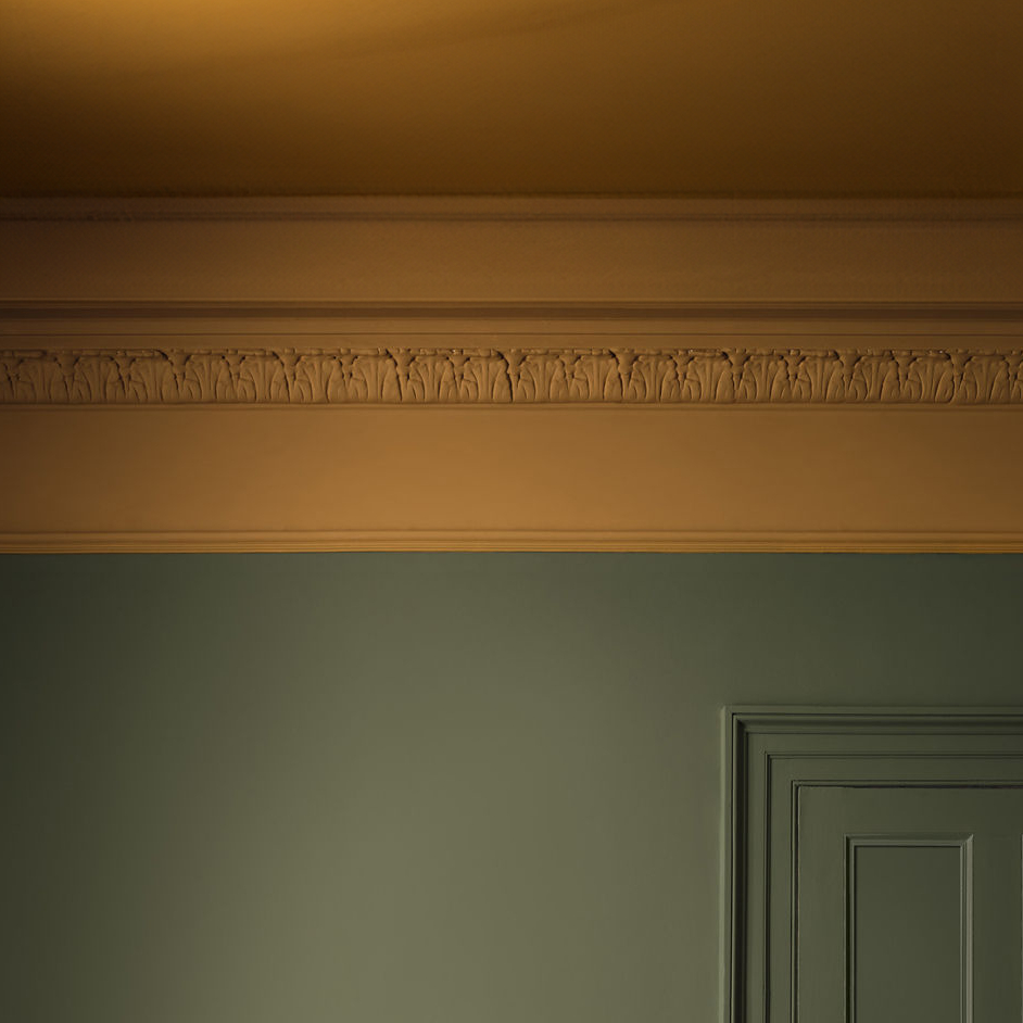
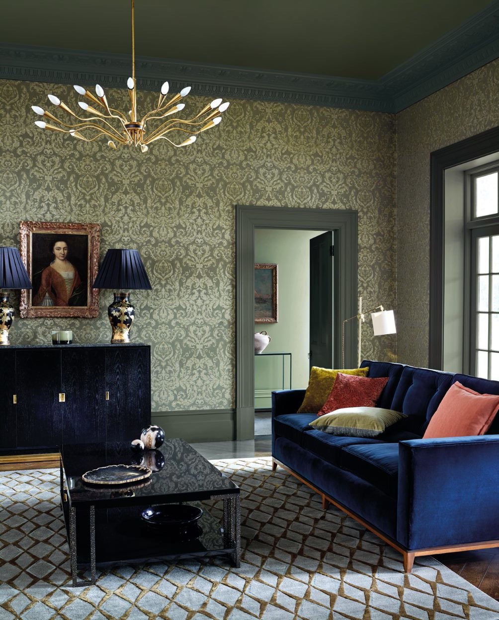
1. Walls painted in a light colour, ceiling in dark colour
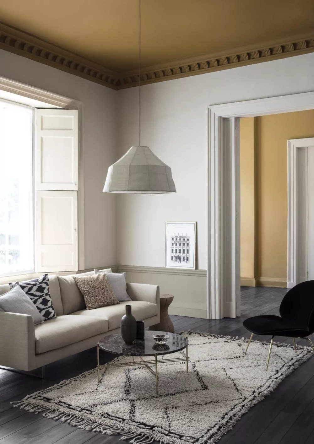
The contrast between wall colour and ceiling colour can be used to emphasise decorative elements or architectural features in the room. In classic rooms or historic buildings, light walls are therefore often combined with a darker, often contrasting colour on the ceiling. This creates visual tension and draws the eye upwards, making the room appear larger and more open. At the same time, the dark colour acts as an enveloping canopy. It also emphasises accents such as chandeliers or ceiling decorations as well as wall friezes below the ceiling.

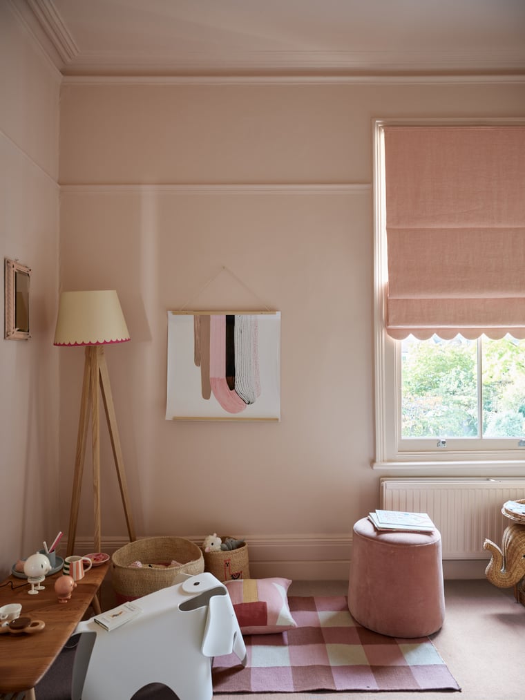
2. Paint the ceiling a lighter colour than the walls
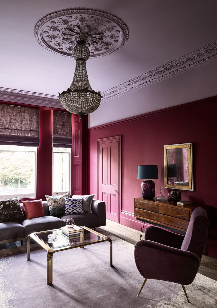
Painting the ceiling a slightly lighter colour than the walls creates a subtle contrast in the room. Using a related tone for the ceiling that is a few shades lighter than the wall colour creates a harmonious effect. At the same time, the architectural features of the room are emphasised.
It is also possible to use a lighter colour for the ceiling that also contrasts with the basic tone of the walls.

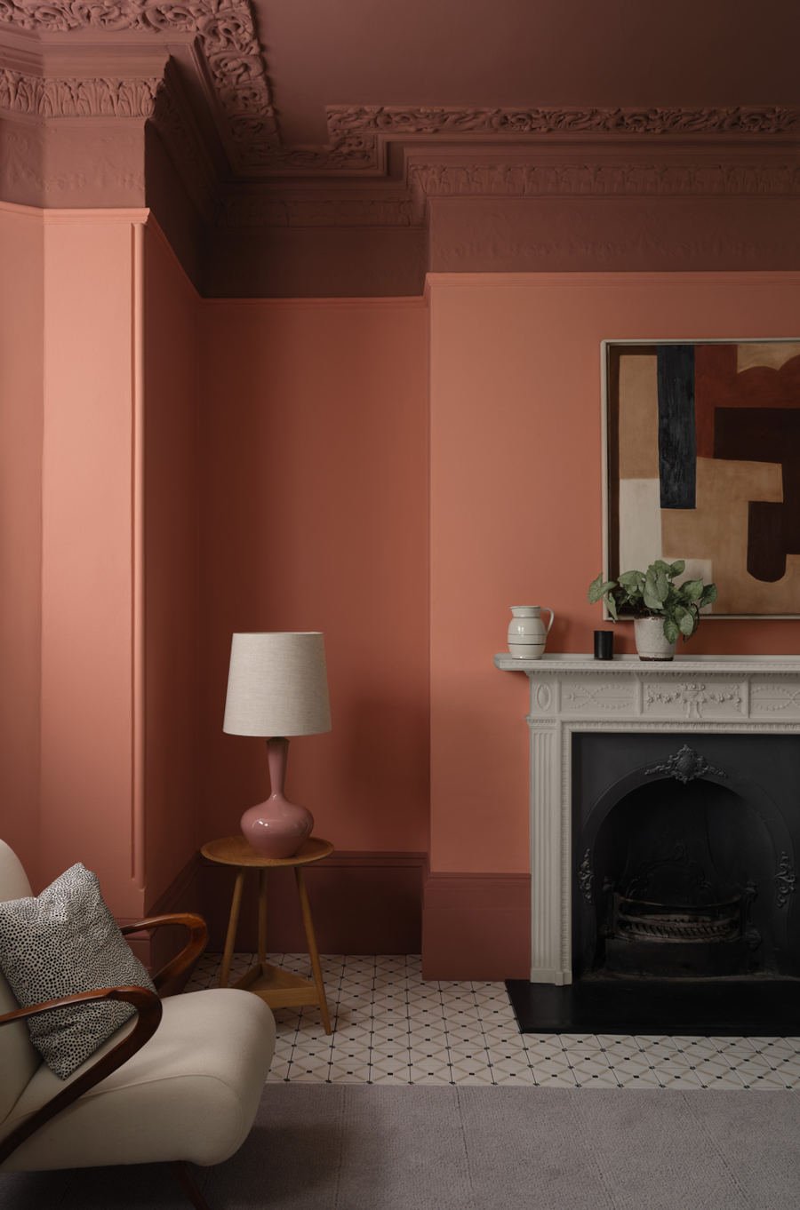
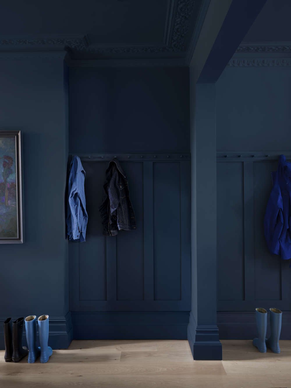
3. Colour drenching: walls and ceiling painted in the same colour
Colour drenching involves choosing the same colour for the walls and ceiling. Other elements in the room such as furniture, doors or wooden mouldings are also painted in this colour. Even floors can be included in this colour concept.
Rooms become visually higher as the boundary between the ceiling and wall is dissolved. Details in the room are only emphasised by the light coming in through the windows or the lighting from lamps.
Depending on the chosen colour tone, colour drenching gives rooms either a typical English style or a Scandinavian country house look. A narrow room looks more harmonious, a large room cosier.
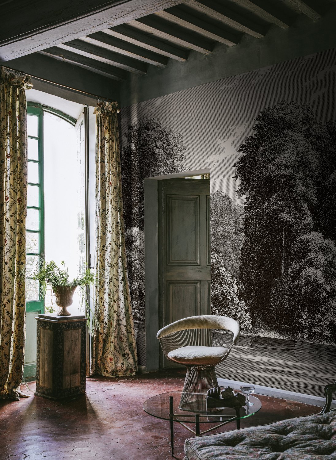
4. Walls wallpapered, ceiling painted with colours found in the wallpaper
If coloured wallpaper is used on the walls, the ceiling can pick up a colour tone from the wallpaper. This creates a harmonious overall impression. This colour concept also makes the room appear higher, as the boundary between the wall and ceiling is dissolved.

Subscribe to the MEINEWAND blog
Never miss another blog post again!
We'll keep you informed by e-mail of each new blog post.

- Discover wallpapers from Morris & Co at meinewand.com
- Discover wallpapers from House of Hackney at meinewand.com
- Art Nouveau wallpapers at meinewand.com
Image Sources: Paint & Paper Library (3), Farrow & Ball (2), Zoffany, Rebel Walls; Aufmacherfoto: Paint & Paper Library