There is a growing understanding of the effect of colour

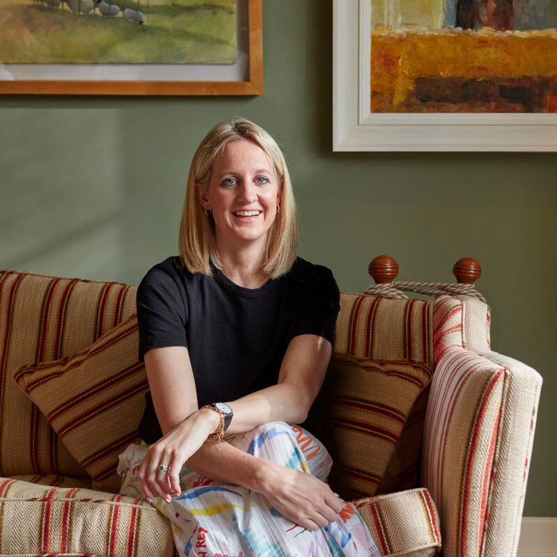
Ruth Mottershead is Little Greene's creative director. In her role, she is responsible for developing new colour tones and designing the wallpaper collections. She comes from the family of owners of the long-established English family business in Manchester and has been involved with colour since she was a child. Master interior decorator Kai Bergen from MEINEWAND spoke with her.
Kai Bergen: Ruth Mottershead, what colour trends do you see at the moment?
Ruth Mottershead: What is particularly important to me is that our customers' understanding of the effect of colours in a room has increased significantly in recent years. In 2021, we started to raise awareness of the topic of colour drenching for the first time. Since then, we have seen that the concept of using the same colour tone in different shades for floors, walls, ceilings and furniture in the same room is being implemented more and more frequently.
‘Our customers' understanding of the effect of colours has increased significantly in recent years.’
A more recent trend is double drenching. Here too, as with normal colour drenching, as many elements as possible are painted in one room. However, different colour tones are used. As a rule, the colour tones have the same intensity and come from the same colour family, but have different undertones. For example, our Tivoli, Woad and Blue Verditer tones can be used side by side in the same room.

An example of intensive double drenching with different shades of blue
Kai: As Creative Director at Little Greene, you also deal with country-specific features in colour design. How does the approach to colour design in the UK differ from that in other countries?
Ruth: In this country, over half of the houses are more than 100 years old. The colour concepts that are used there often refer to the period in which the house in question was built. They are therefore classically inspired. However, we are also seeing a change in the way our customers design their interiors in the UK and around the world. People are increasingly looking for warm, cheerful and inviting interiors that they feel comfortable in. Overall, our customers have also become bolder in their choice of colours.
The so-called Boot Room was traditionally the room in larger English houses where shoes were changed when returning from the garden, sports, fishing or hunting. Today, it is usually simply used as a cloakroom. The modern colour concept in this Boot Room creates a fresh effect. The Little Greene colours Obsidian Green, Split Pink, Harley Green, Livid and Slaked Lime - Mid are used.
Kai: You also have a background as a garden and landscape architect. Do you think your expertise in garden design feeds into your current role at Little Greene?
Ruth: Even in my childhood colour and design were very present. We talked about it every day at home and one of the first Little Greene colour cards was literally made by my parents at the kitchen table. Before I joined our family business, I actually worked as a landscape architect in London, dealing with the design of gardens, urban spaces and the challenges of historic parks. It was a job where I could combine my love of nature and design. When the opportunity arose to follow my brother into our company, I returned to colour, so to speak. And indeed, interior design is closely related to the horticultural design of outdoor spaces.
"Even in my childhood colour and design were very present."

Kai: In Germany, using a single shade of white for wall and ceiling design is still very common. So, what should someone consider if they want to add a little more colour to their rooms?
Ruth: Using neutral shades from the same colour family is a great way to subtly add more excitement to a room. The Little Greene colour palette is very well suited for this, because within each colour family, such as the colour family of our reds, there is always a range of more neutral colours. These neutrals have the same base colour as the other shades in the colour family. However, due to their lower pigmentation, they have a restrained, harmonious and timeless effect in a room. They can also be combined very well with each other, using one for the wall, another for the ceiling and a third for wooden elements or furniture. They also guarantee a seamless transition from one room to the next when used in several rooms.
If you want to add further design touches to this neutral colour scheme, you can experiment with the different degrees of gloss offered by Little Greene, for example by using a glossy paint like our Intelligent Gloss alongside our very matt Absolut Matt Emulsion in the same room. Depending on the degree of gloss, the intensity of a colour tone changes, creating subtle differences in the room.
"You can experiment with different gloss levels to create design highlights."
>> Blog article "Combining matt and glossy finishes"
Kai: The colour consultants at MEINEWAND know a lot about colour psychology, i.e. how certain shades can affect us. Nevertheless, many of our customers tend to choose intuitively one colour or another at the end of a consultation, simply because they like one colour better than the other. What do you think of this rather personal approach to colour selection?
Ruth: Colours can have a huge impact on a room. The effect ranges from bold, dramatic and energetic to calming and warm. You should always be aware of this before choosing a colour and definitely take advantage of professional advice like that offered by MEINEWAND. When deciding on a colour, you should avoid following trends. You shouldn't choose a colour just because it's particularly popular at the moment. In the end, you should select the colour that appeals to you personally, after all, you will be seeing it every day in the future.
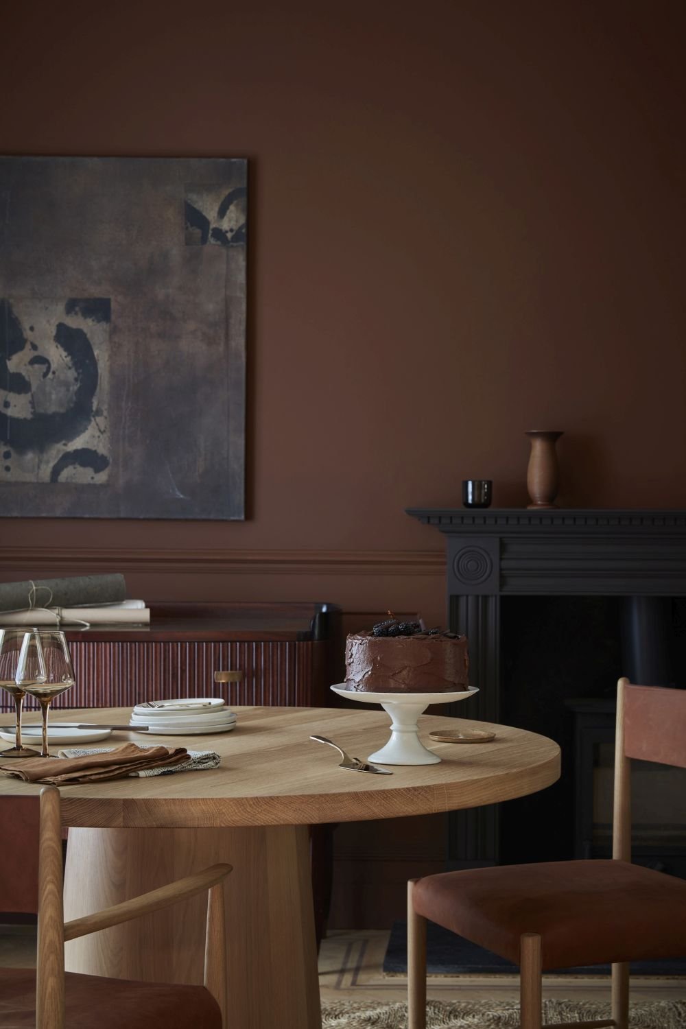
Colour psychology is also important when deciding on a colour. For example, dark brown tones such as Ganache from Little Greene have been proven to have a warm and calming effect.
Kai: Which shades from the Little Greene colour palette have been particularly popular over the years?
Ruth: Interestingly, some of the oldest colours in the Little Greene colour range are among the most popular. Celestial Blue, for example, is a beautiful, soft tone that is still very popular for front doors in England today and dates back to 1807. French Grey is also one of them. This is one of our colour shades that was developed at the end of the 19th century during the Victorian era.
Celestial Blue by Little Greene
Kai: Alongside the paints, Little Greene also offers wallpapers that perfectly match your colour tones. Which wallpaper patterns are particularly close to your heart?
Ruth: That's not an easy question for me to answer, because our wallpapers are deliberately designed to offer as many colour, design and style options as possible.
Our heritage-inspired wallpapers, such as the surface-printed Bamboo Floral, can make a strong design statement in a room, but they can also be used to create a sense of intimacy and comfort. They work well in a classic interior, and in a modern interior where the pattern contrasts with contemporary furniture and artwork, they can create a sense of familiarity and comfort.
For a more dramatic effect, consider a large-scale panoramic wallpaper in a living room. A lush tropical wallcovering like Capricorn will transport you to a magical world every day.
For a cosy guest room, I would consider a delicate wallpaper like our Lower George Street in the Carousel colourway.
Bamboo Floral wallpaper by Little Greene
Capricorn mural by Little Greene
Lower George Street wallpaper by Little Greene and colour Mid Azure Green by Little Greene
Picture Source: Little Greene


