A new coat of paint for walls, wood panelling or ceilings is a simple and effective way to give your room a new look. Use these 4 + 1 classics of colour design to create lasting perfect interiors.
In the spirit of lasting colour design for rooms, our colour consultants rely on design concepts that have proven themselves in many customer projects. With the harmonious and finely nuanced colour palettes of our English paint brands such as Farrow & Ball, Little Greene and Sanderson, these can be implemented to perfectly suit the individual room. We present 5 colour concepts that we consider to be the most important.
1. Colour Drenching
With colour drenching, the entire room is painted in a single shade or closely related shades. Walls, ceiling, skirting boards, doors, other wooden elements and even furniture are painted in the same tone. In the case of wooden floors, these can also be included.
Architectural details are deliberately not emphasised by contrasting colours in this frequently used colour design technique, but only accentuated by the incidence of light through the windows or the light from lamps.
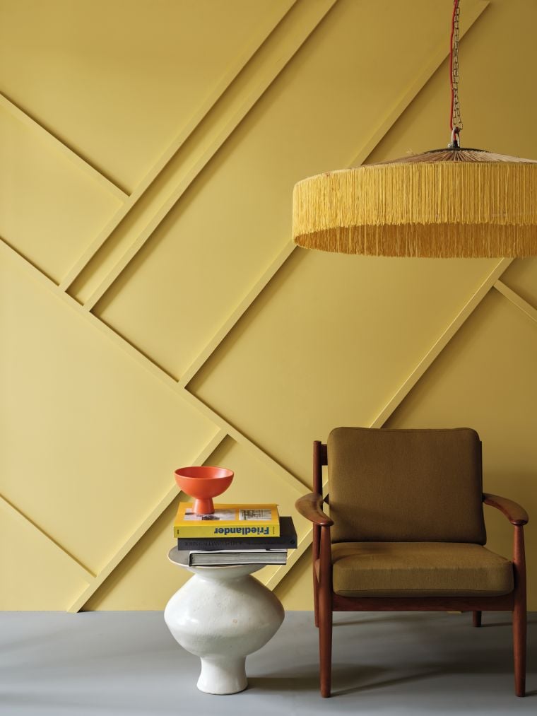
 Shade Giallo by Little Grene
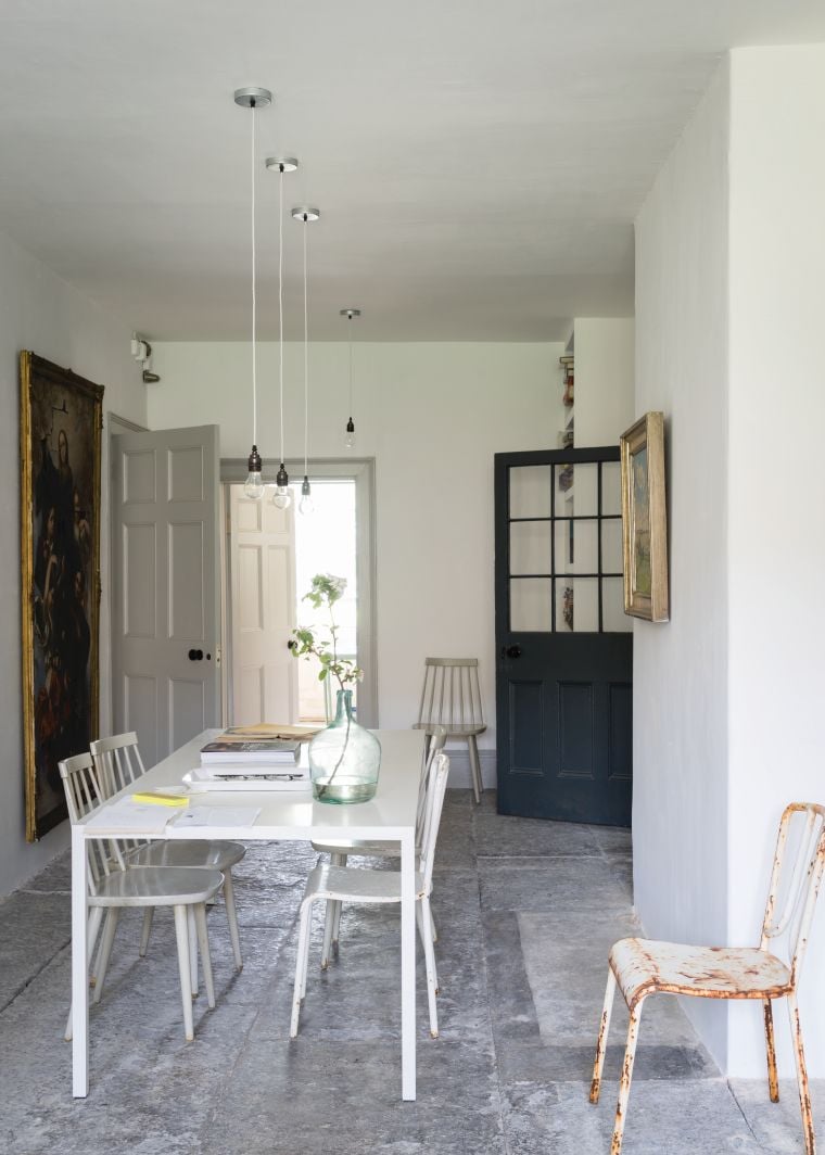
Shade Railing by Farrow & Ball
Depending on the colour shade chosen, colour drenching either gives rooms a typically British style or lends them a typically Scandinavian country house look. The interior design concept also looks well thought-out and coherent, especially if the doors are painted in a similar colour to the walls and when the ceiling is included in the design. In addition, colour drenching visually stretches the room by removing the visual boundaries between ceiling, wall and floor.
Consistent implementation of the Colour Drenching concept enhances both large and small rooms: A narrow room appears more harmonious, a large room becomes cosier.

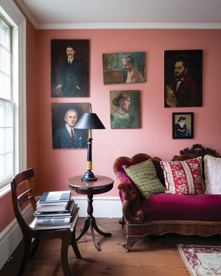
2. Colour design with pastel shades
Pastel shades radiate lightness and appear warm and optimistic. At the same time, they are reserved and do not push themselves into the foreground. A combination with white or grey tones makes them look stronger. If desired, they give rooms a classic British or French look, but can also be used for modern interior designs.
Shade Nancy's Blushes by Farrow & Ball
Citrona by Farrow & Ball shows what a contemporary interpretation of understated, powdery pastels can look like. Californian designer Kelly Wearstler, who developed the tone for Farrow & Ball, was inspired by the US West Coast coast and its sun-drenched nature. In addition to this light colour, she has created a further 7 colours including contrasting greys and blacks.
 Shade Citrona from Farrow & Ball's California Collection
3. Colour design following the Wabi-Sabi principle
Wabi-sabi has shaped Japanese design for centuries. It celebrates the beauty of simplicity and also embraces the imperfect. Applied to modern wall colour design, the wabi-sabi approach can be used to create interiors that fit perfectly with the concept of slow living and mindfulness. Calm earth colours, fine shades of grey, off-white and muted shades of green and blue are used. They bring warmth to the interior and make the room appear larger.
White tones can be found in many nuances in the colour palettes of Little Greene and Farrow & Ball. Combining lighter and darker versions of white creates a calm, neutral yet inviting space.
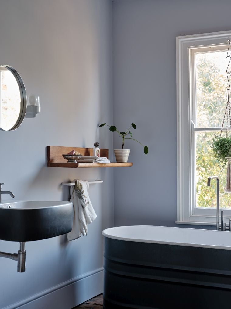
Shade Ammonite by Farrow & Ball
Shade Calluna by Farrow & Ball

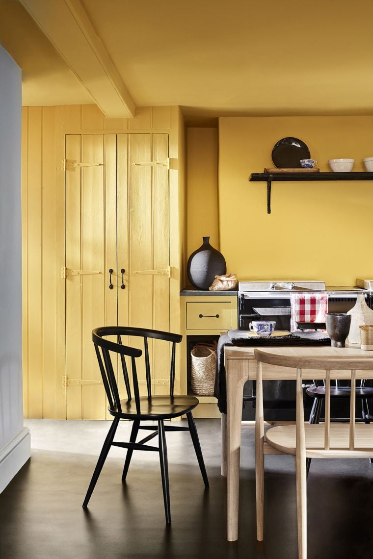
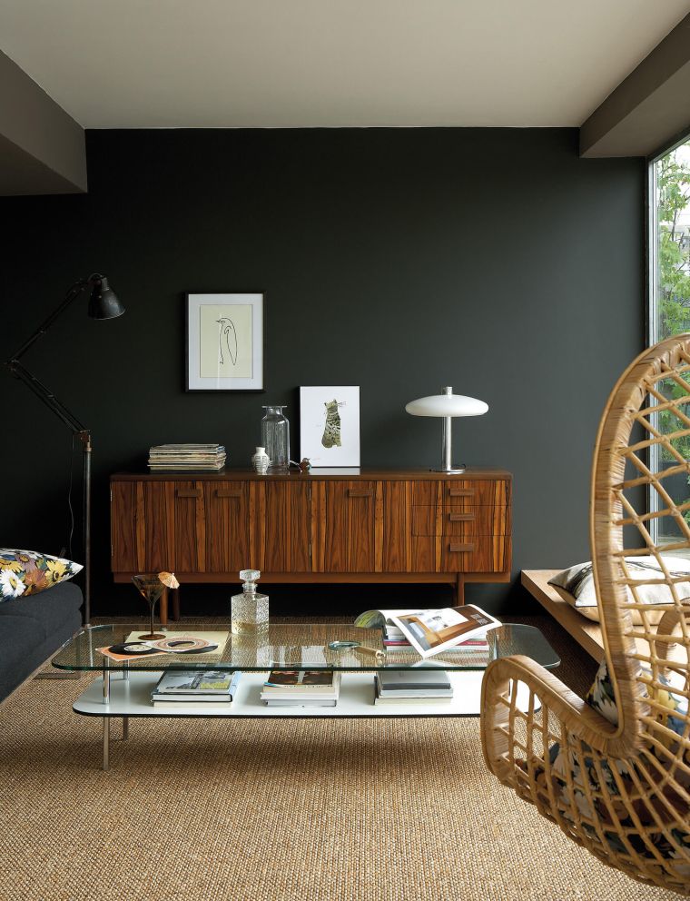
4. Make clever use of accent shades and statement colours
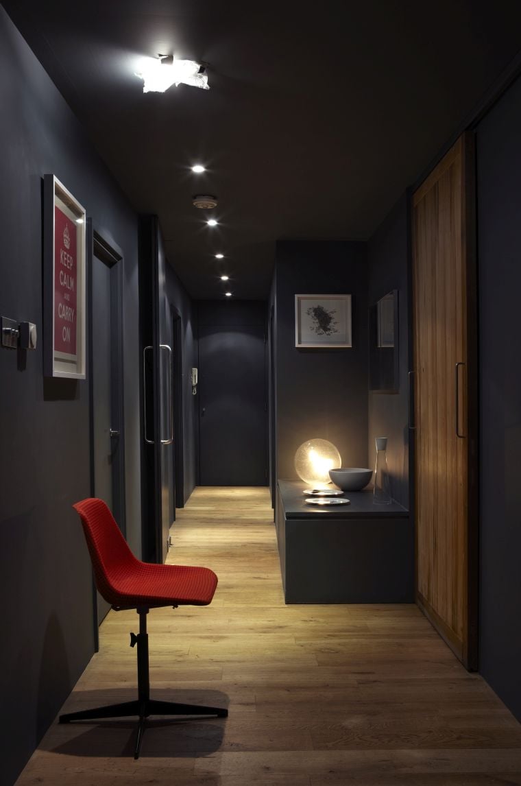
In many settings, strong colour tones are a good choice. Large rooms look cosier with rich and dark blues and warm reds, yellow statement tones bring optimism to the room.
When combined skilfully with lighter shades, dark statement tones make rooms feel more homely. In addition, walls painted in darker tones appear visually closer. This is why hallways and corridors lose their tubular effect by painting the terminating transverse wall darker than the longitudinal walls.
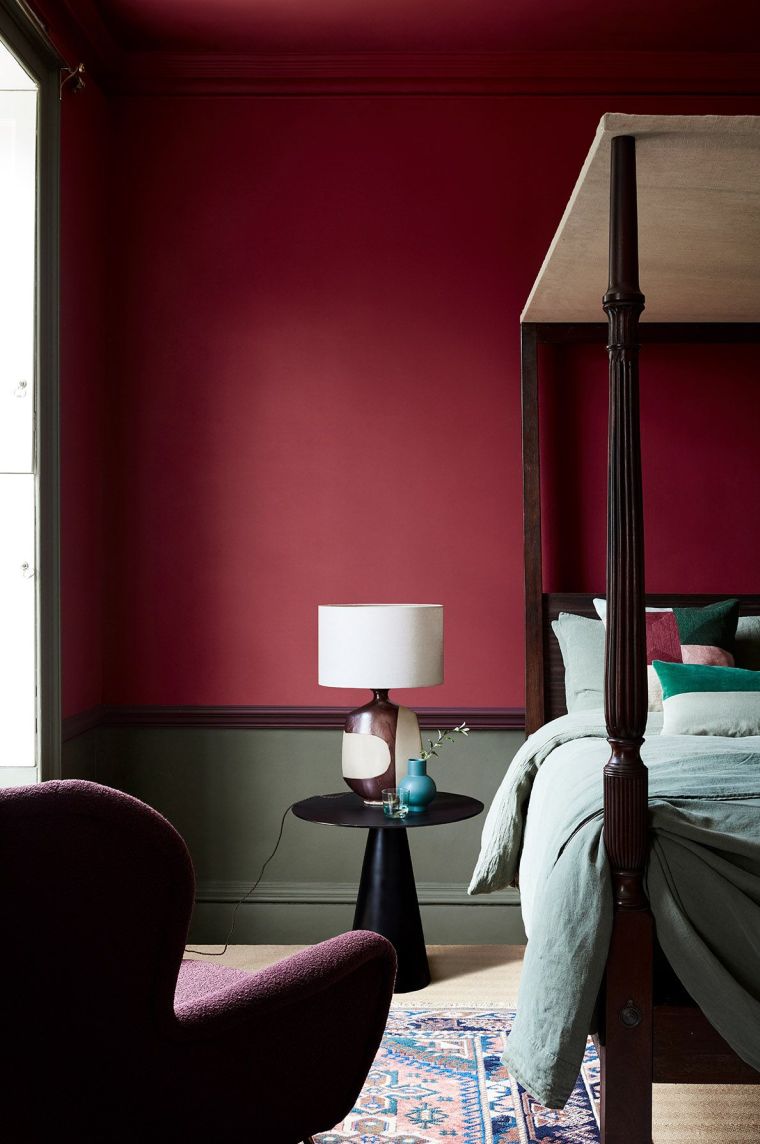
Shade Baked Cherry by Little Greene
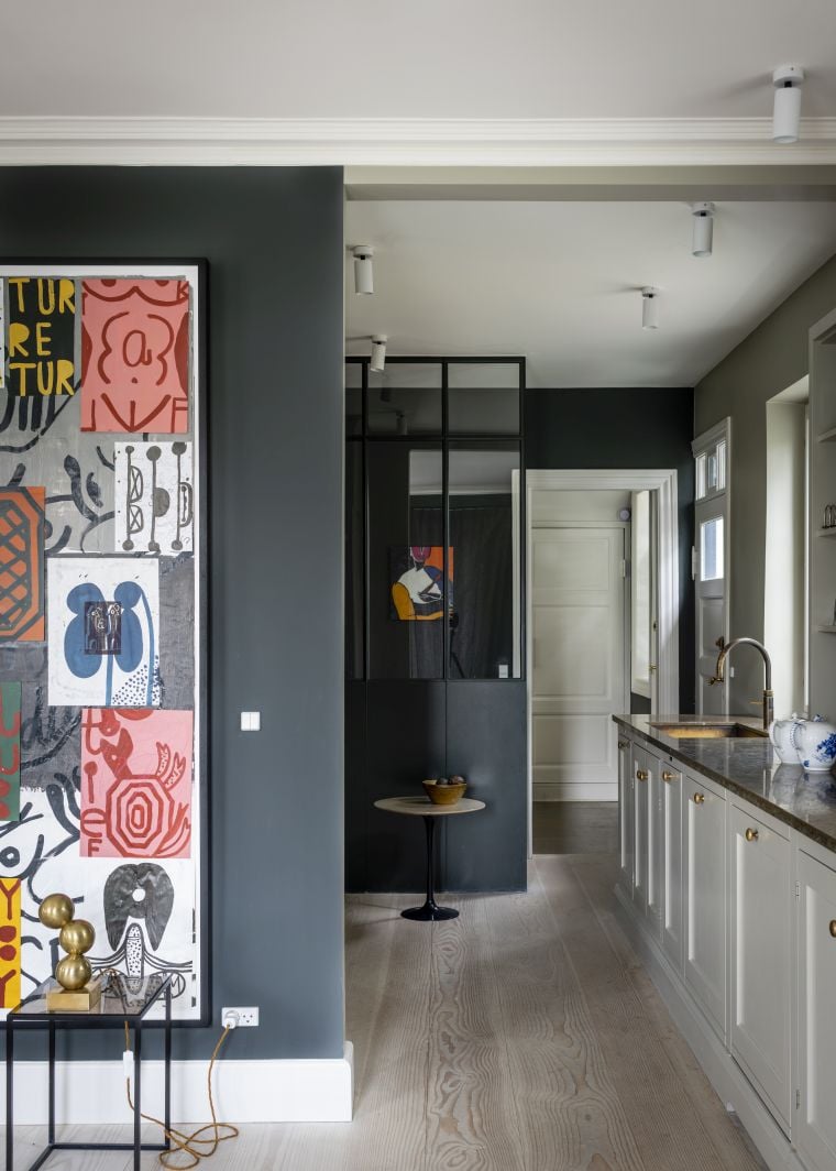 Shade Studio Green by Farrow & Ball
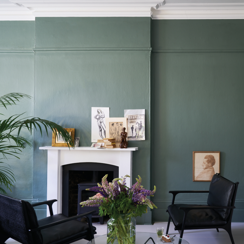
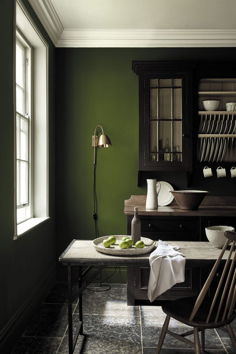
5. Almost a classic: green shades
Not yet a classic but still part of our list are shades of green. They are the right choice for many room situations. Green, a very dominant colour in nature, evokes a sense of tranquillity in interiors. Rich green tones in the kitchen, reminiscent of trees and lush foliage, velvety, dark green tones or a deep grey-green in the living room and light, uplifting tones in hallways and bathrooms have a restful effect. In the home office, green tones help with concentration and contemplation.
Shade Jewel Beetle by Little Greene
Shade Green Obsidian by Little Greene

For your colour planning, we recommend the colour cards of the brands, as the representation of the colours on the sceen can differ greatly from the original colour tone. The cards provide a very accurate picture of the original colour tone and serve as an important reference for you. We send them to you free of charge. As we have the Farrow & Ball and Little Greene cards in stock, they will usually be with you in one to two working days.
Subscribe to the MEINEWAND blog
Never miss another blog post again!
We'll keep you informed by e-mail of each new blog post.

Bildquelle: Little Greene (1, 7, 8, 9), Farrow & Ball (2, 3, 4, 5, 6), Teaser: Farrow & Ball