“If you don`t like green, you don`t like green”
meinewand.com founder Sebastian Stahl and meinewand.com colour consultant Kai Bergen had the chance to talk to Patrick O’Donnell, international brand ambassador and VIP colour consultant of Farrow & Ball, about his approach for perfect colour-based interior designs and the new, reformulated Dead Flat finish by Farrow & Ball.
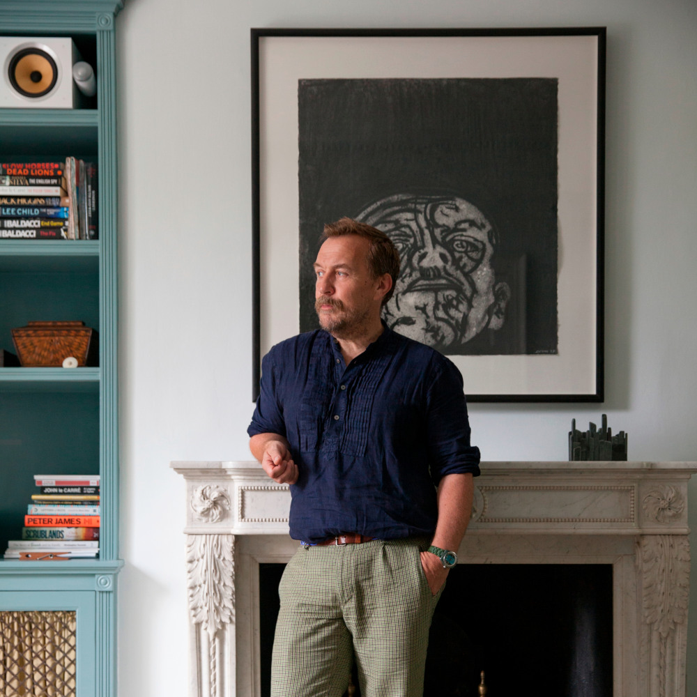
Sebastian Stahl: Hi Patrick, for all our readers with a long-standing interest in Farrow & Ball you are very familiar as one of the most prominent faces in Farrow & Ball's videos on Instagram and other channels. For those who do not know you yet, can you introduce yourself?
Patrick O’Donnell: Hi Sebastian, I certainly can. I’ve been at Farrow & Ball for over a decade now moving from the showroom to running our global Colour Consultancy service and now, as you mentioned, International Brand Ambassador. I work with top tier designers, doing Colour Consultancy for VIP clients, press quotes and interviews for international editorial and of course, social media content.

Sebastian: What are some of the driving colour trends you are currently seeing?
Patrick: Everybody still loves blues and greens, primarily because they are both wonderful colour families to live with. But we are seeing more mid-toned blues and greens driving trends, like the elegant Oval Room Blue or Selvedge, and one of our new blues, Kittiwake, which brings a bright and breezy freshness to an interior.
The other driving trend is yellow, especially as a choice for cabinetry. Sudbury Yellow or the bolder Babouche make an interesting and energising statement as a kitchen unit colour, but softened by keeping other elements such as walls and ceilings in a gentle off white like School House White.


Kai Bergen: As international brand ambassador, you are working with designers both across the UK and North America. Both regions have their own approach to how they use colour. You talked about that in depth in an interview with Farrow & Ball's blog “The Chromologist”. How do other European and especially German interiors compare to the UK and North America?
Patrick: The UK definitely contrasts with other northern European countries, with its rich palette of interior colours. Most countries such as Germany, the Netherlands, and most of Scandinavia enjoy a simpler palette that often hovers around neutrals and whites but with accents of darker colours thrown into the mix. Think Slipper Satin with Green Smoke, or Shaded White and Stiffkey Blue. But we are also seeing some hotter colours used judiciously in European interiors, such as our new spiced red Bamboozle which looks beautiful applied to a bookcase in a living room.


Sebastian: Farrow & Ball recently relaunched its ultra matte Dead Flat finish. What are the benefits of its the new formula?
Patrick: A labour of love for our chemists who have taken five years to reach this point, we are so excited by Dead Flat. Honouring the classic Farrow & Ball aesthetic of an ultra matt finish while offering real everyday practicality for busy homes – the finish is Class 1 scrub test, fully washable and wipeable, and can be applied to walls, woodwork and metal – this is your ‘go to’ finish for peace of mind practicality for nearly every room in your home, as we still recommend Modern Emulsion and Modern Eggshell for kitchens and bathrooms. The depth of colour feels richer too, especially at the darker end of the colour spectrum.
Kai: With its new formula Dead Flat seems ideal for colour drenching. Can you first describe the concept of colour drenching and also tell us about the effect the ultra-matte look of Dead Flat has on a room.
Patrick: Colour Drenching is essentially saturating every surface in one room in your chosen colour – from walls, to ceiling, woodwork, and metal (such as radiators). By doing this in Dead Flat, which has a 2% sheen, you get a beautiful absorption of light, especially the darker you choose to go. Your walls almost look like suede, so tactile yet so discreet!
Kai: When you do colour drenching, you have to decide on one colour, but often are almost at liberty which colour to choose, especially when there is no reference point in the form of another colour in the room. What`s your approach in these cases?
Patrick: Just follow the basic principles as you would with any colour choice. So when deciding, do consider the aspect of your room (North, East, South, West), which colours you are personally drawn to, and how you want the room to feel (dark, cosy, fresh etc.).
One room painted all in Skimming Stone Dead Flat will feel calm and gentle, another room painted all in Hague Blue Dead Flat will feel dramatic and sexy, and one painted all in Red Earth will feel rich and cosy …


Sebastian: Here in Germany interiors are often painted with pure white tones i.e., non-off-white tones. Strong colours are commonly only used for individual walls and hardly ever for ceilings. We often hear from our customers that they are afraid, that using a strong or dark tone for colour drenching makes the room look smaller. We have recently painted one of our offices completely with Book Room Red by Farrow & Ball and have once again noticed the exact opposite: The room now seems much wider, and the ceiling much higher. What is your take on colour drenching with strong or dark tones?
Patrick: By painting everything in one colour, even in small spaces you eliminate any contrasts in a room. You become less aware of where the wall height finishes or is broken up by a doorway that would otherwise be painted white. It’s often a great technique for smaller spaces, especially in darker colours – they will also become more cosy, more intimate to be in.
Kai: As colour consultants we know a lot about colour psychology i.e., how colours affect us. However, at the end of many colour consultations a lot of my clients tend to decide intuitively on one colour shade or another, simply because they like some colours more than others. What do you think of this slightly more personal approach towards choosing a colour?
Patrick: I would always err towards the personal choice rather than what benefit the colour can bring emotionally to a space. For example, we know greens can create calm and restfulness, but if you don’t like green, you don’t like green. A home should always reflect the people that live within it and all we can do as Colour Consultants is to guide people to make the right choice or pick the right shade whilst understanding their personal needs and personal preferences.
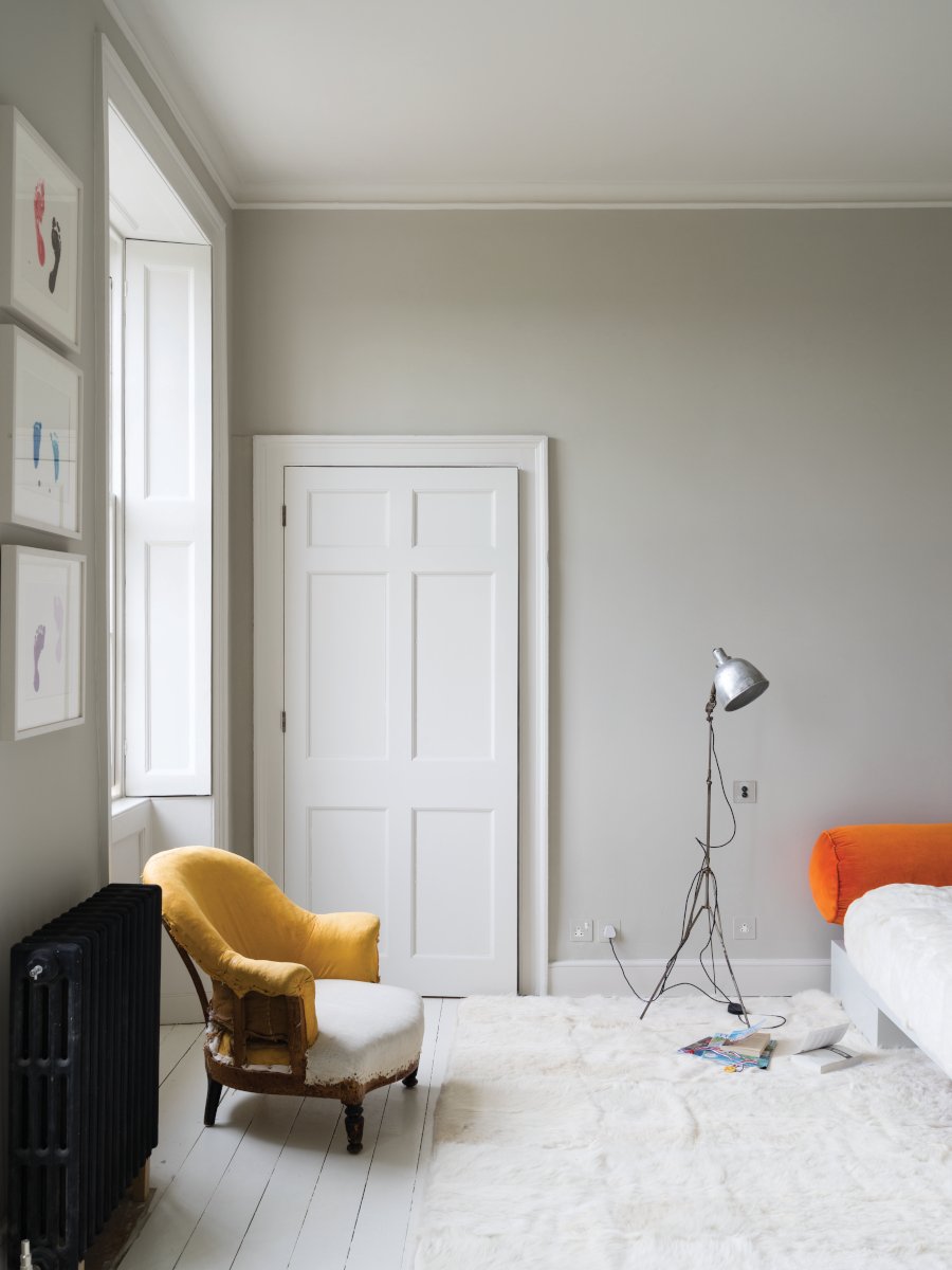
Sebastian: For many years now 241 Skimming Stone and 229 Elephant’s Breath are one of the favourites with our customers. What do you think is the secret of their continuous success?
Patrick: Most people love neutrals and off whites – there is something elemental about their ‘safety’ as a colour. They don’t ‘shout’ too much in a room and are often easy to layer with other elements, such as fabric and art. The great flexibility of both Skimming Stone and Elephant’s Breath is their gentle nuance of lilac/greige that gives them character without dominating a space.
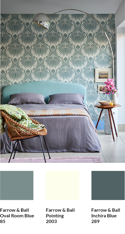
Kai: Particularly popular with our customers is combining wallpaper with matching colours. Farrow & Ball offers a small, exquisitely beautiful wallpaper selection alongside the paints. Can you give us some examples of effective combinations of Farrow & Ball wallpaper and Farrow & Ball paint?
Patrick: We have to talk about Lotus, our bestselling Damask, especially in colour way BP20 53 (containing Oval Room Blue & Pointing). It has an understated elegance to it, but team it with the darker Inchyra Blue on your woodwork for a more contemporary yet tonal look.
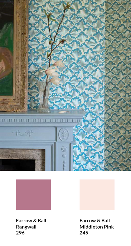
For something more playful and a great option for a child’s bedroom is our playful Aranami BP46 04. Team it with something bold and bright on your trim, like Rangwali. Whilst offering a bright contrast, this bright pink has a similar weight to the wallpaper’s St Giles Blue colour. You could also paint the ceiling in Middleton Pink, to link back to the Rangwali.
Sebastian: Thank you very much for the very inspiring talk, Patrick. Our readers and we got a lot of new ideas for our daily work with Farrow & Ball colours. We are already looking forward to the next interview with you.
Subscribe to the MEINEWAND blog
Never miss another blog post again!
We'll keep you informed by e-mail of each new blog post.

Image Source: Farrow & Ball