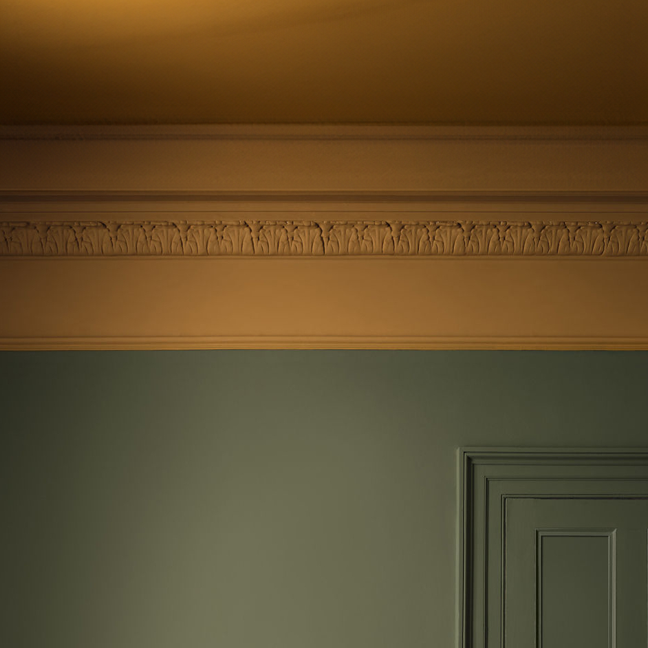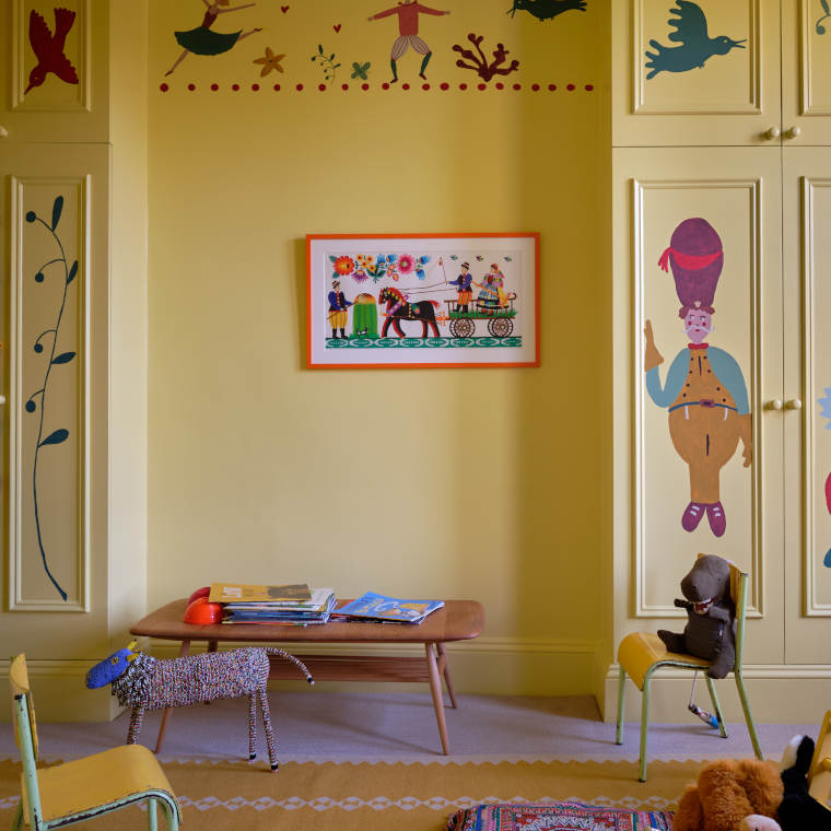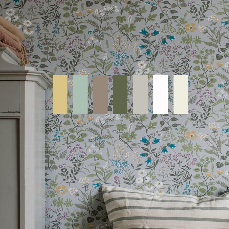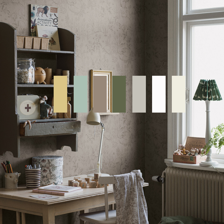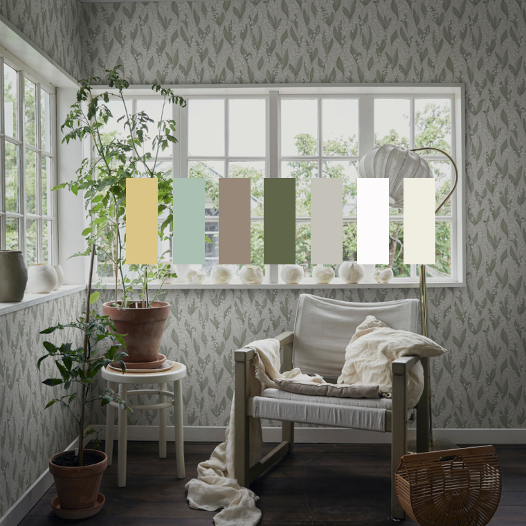
Scandinavian tone on tone
Matching walls and interior tone on tone has a long tradition in Scandinavian interior design. The effect is restrained and timeless.
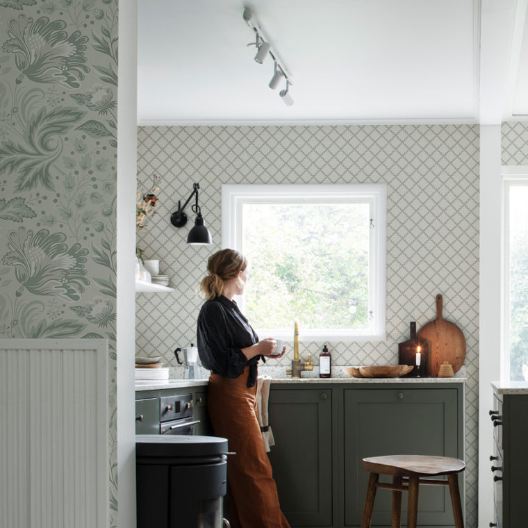
A good starting point for this very Nordic colour concept are the wallpapers of the traditional Swedish brands Sandberg and Boråstapeter, many of which are in subtle colours. Clear white or grey components in all colour tones allow the wallpapers to recede visually in the room.